selected work
CommonLit
Making room for both curiosity and expertise.
Brand Direction
Made with BRAINS
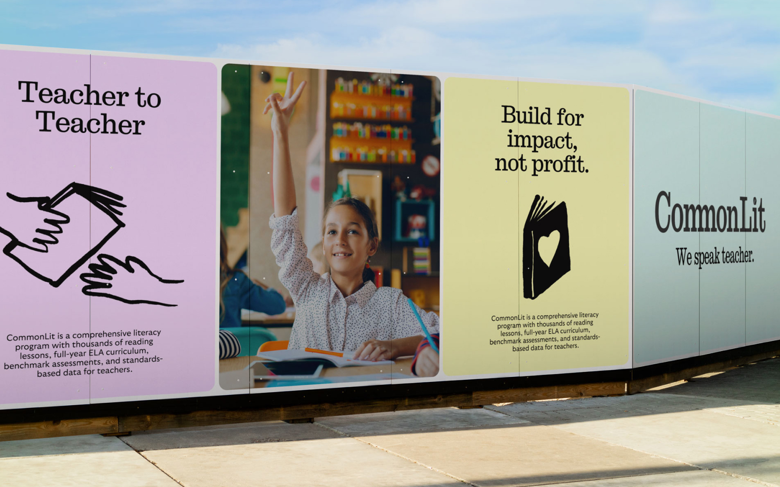
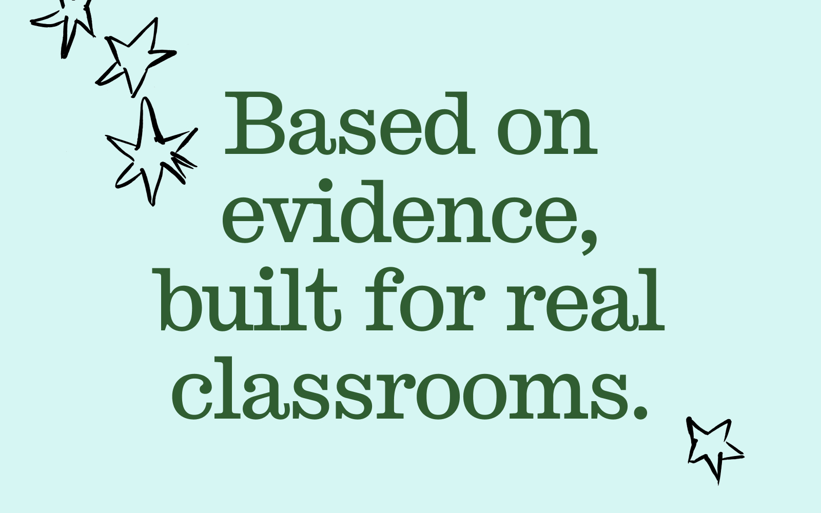
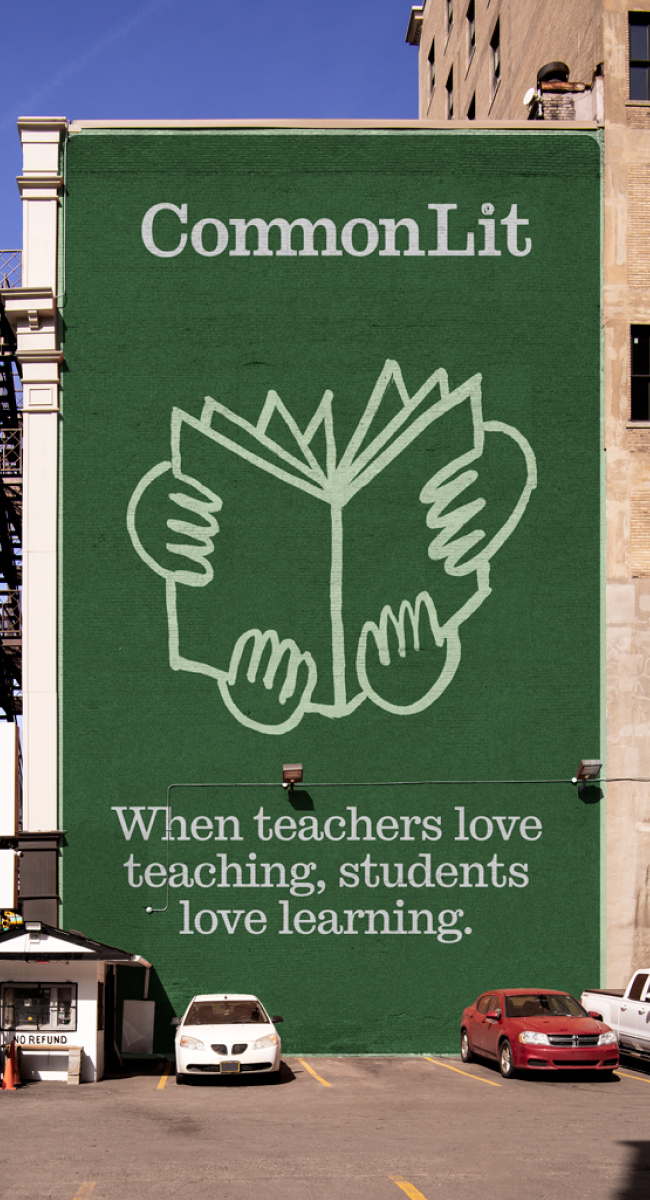
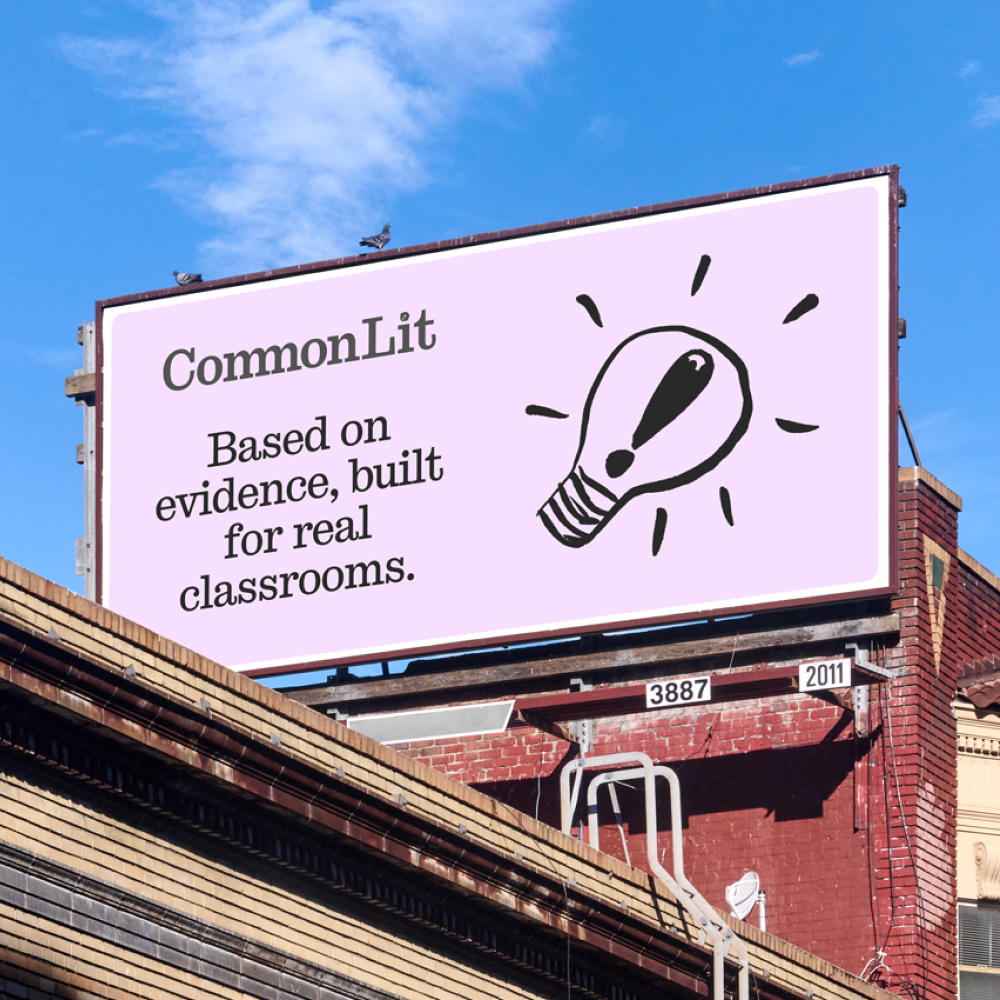
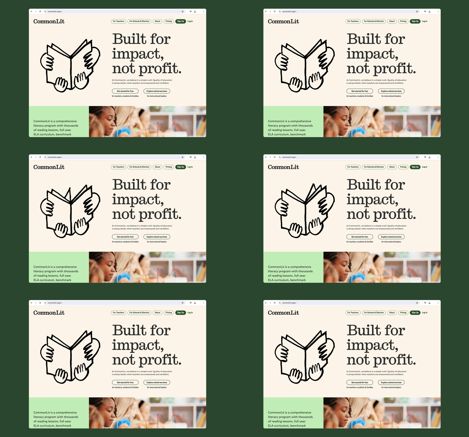
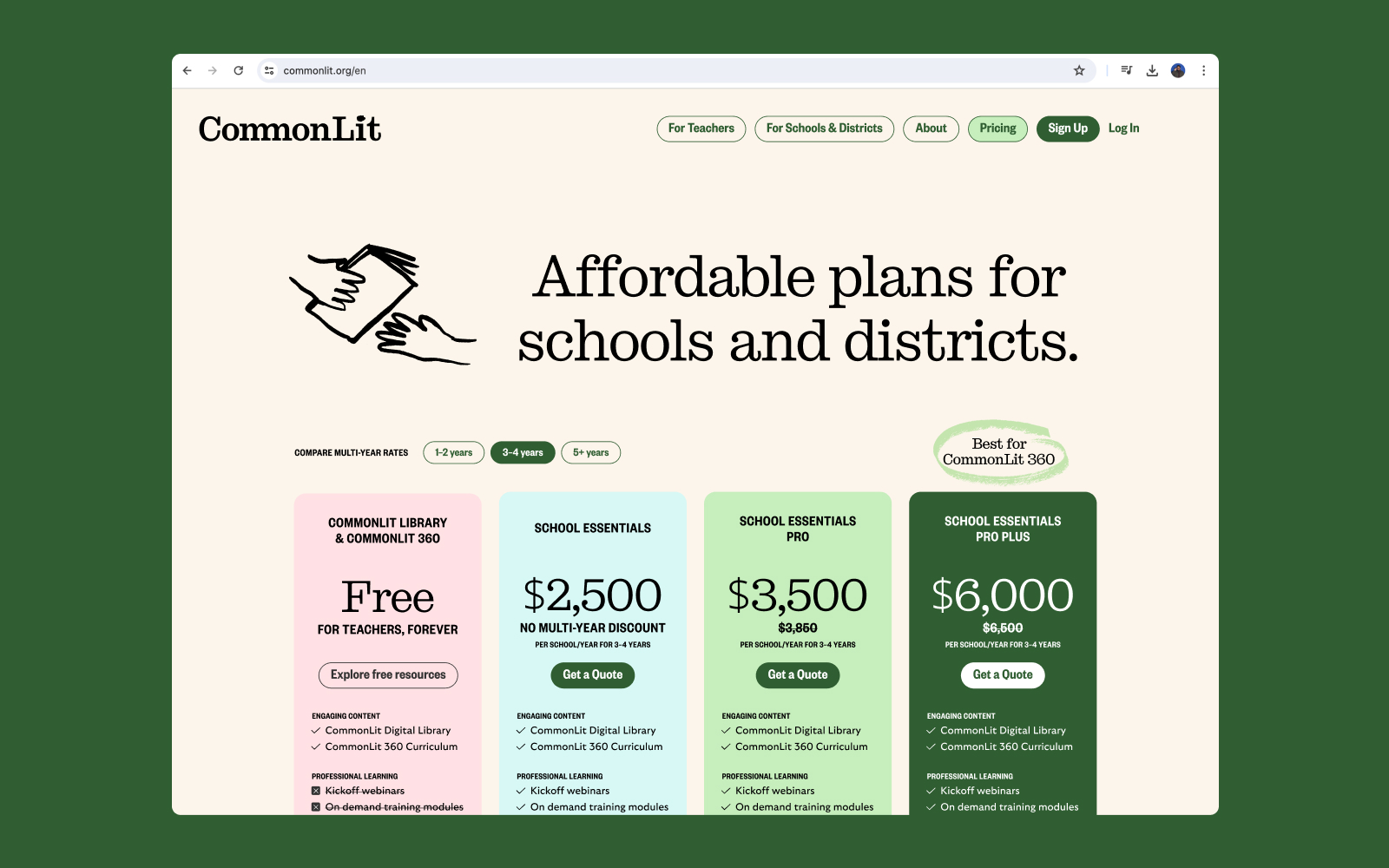
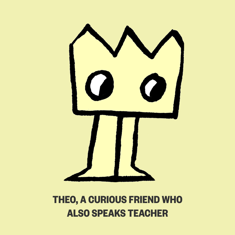
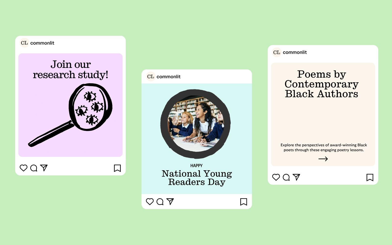
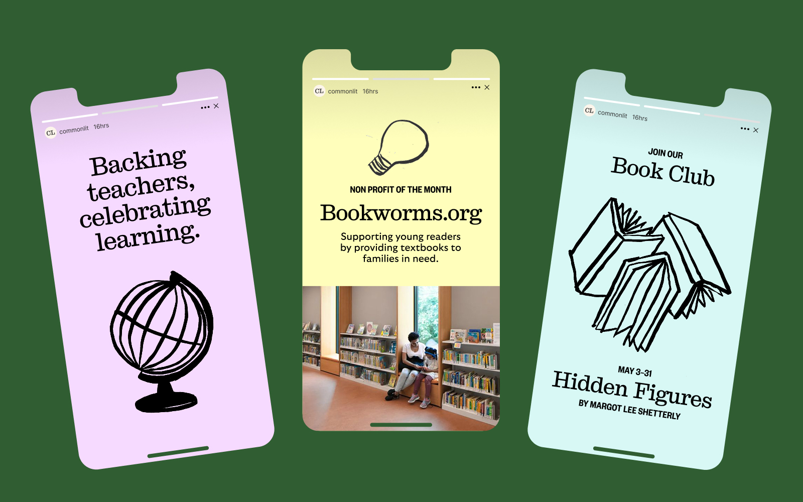
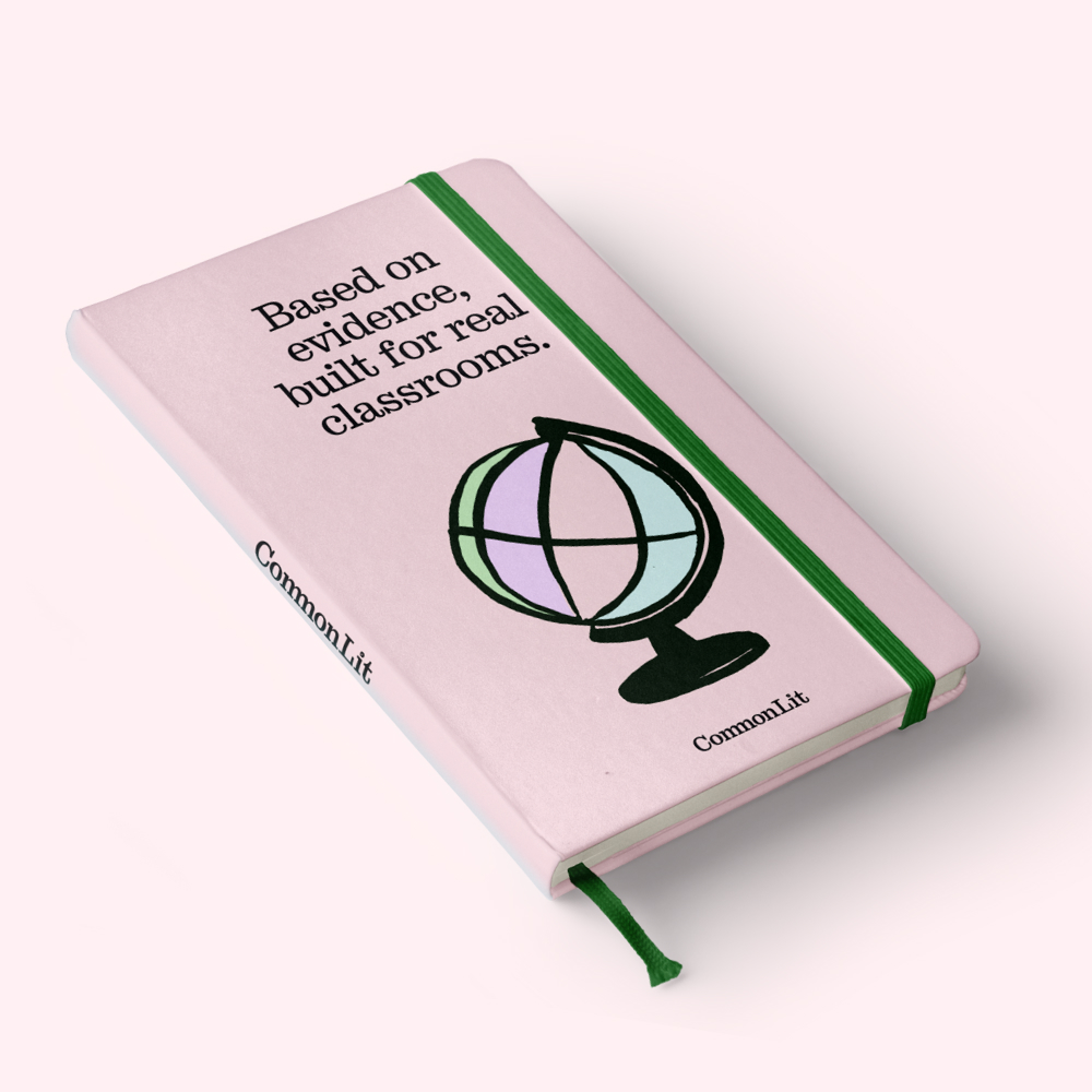
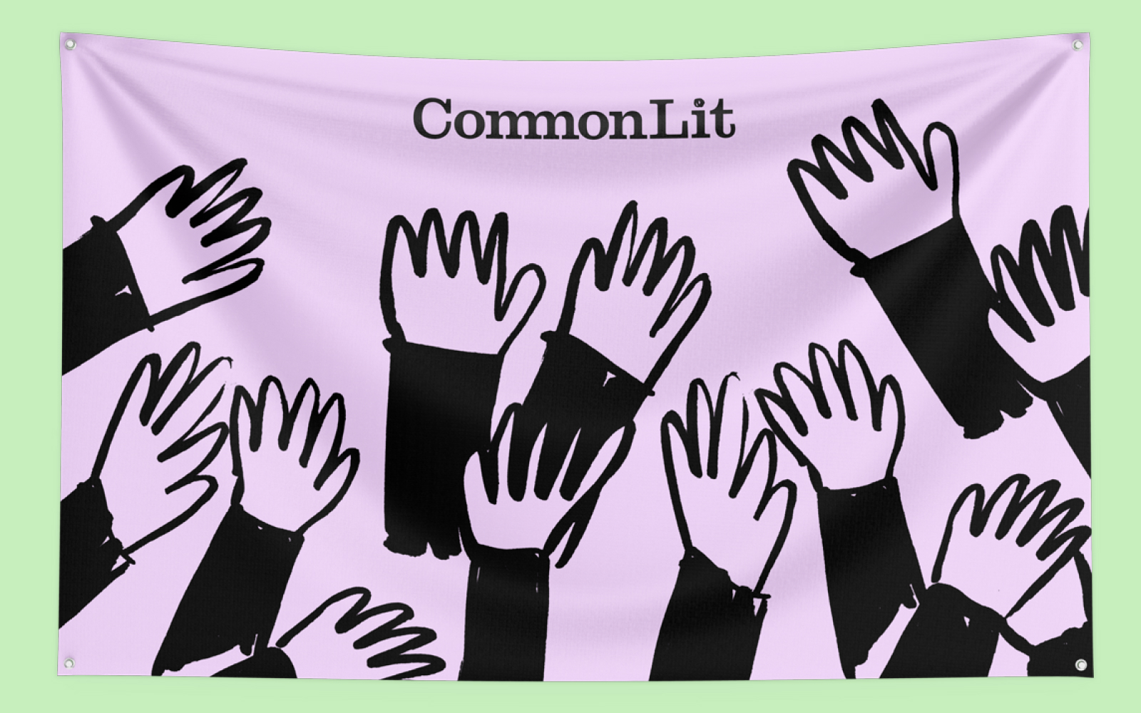
CommonLit supports teachers and students with a large library of literacy resources. For a new brand direction, I built a complete visual system—identity, typography, illustration, a mascot named Theo—and carried it from a wordmark to a pricing page, through campaign and social. Hand-drawn elements and warm color speak to student curiosity without losing the credibility teachers expect.
BallerCam
Turning a sideline into a broadcast booth.
Web Design
Made with BRAINS
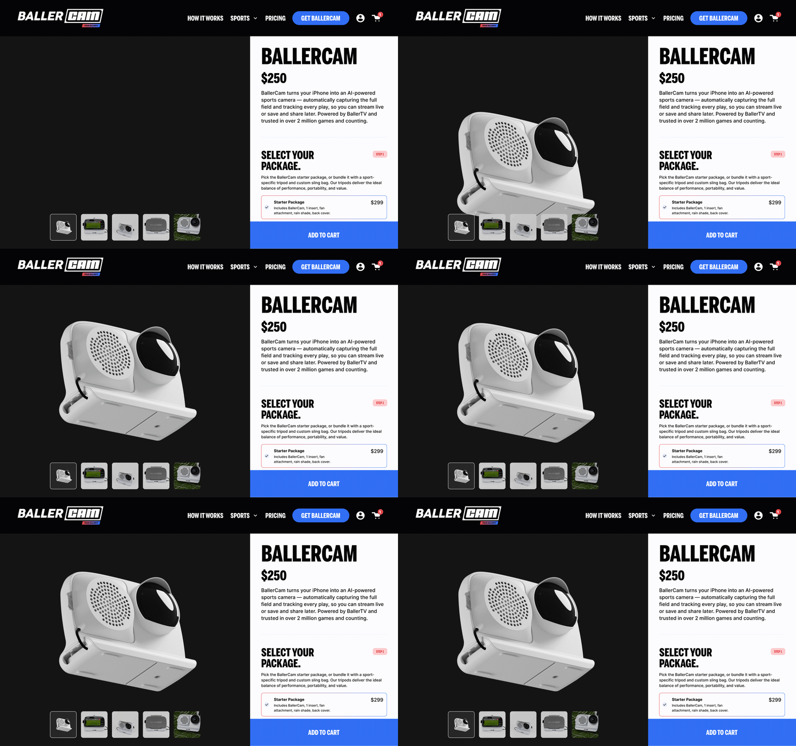
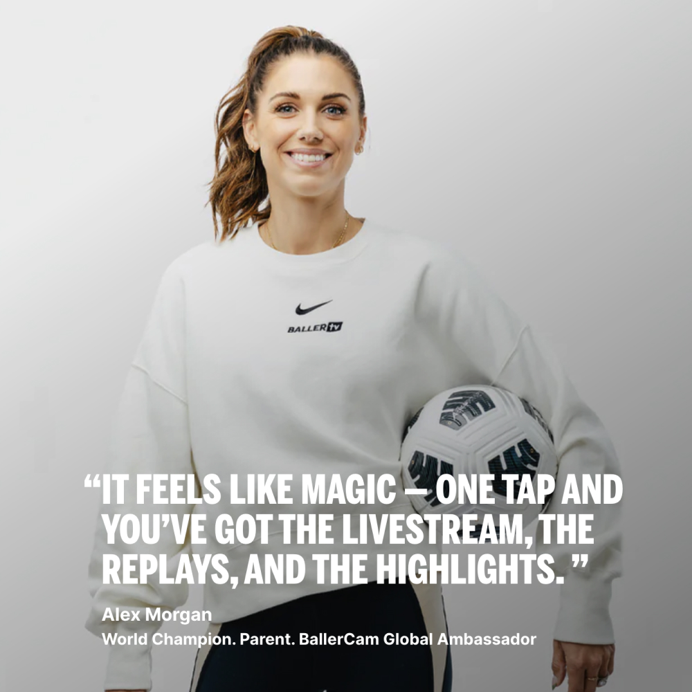
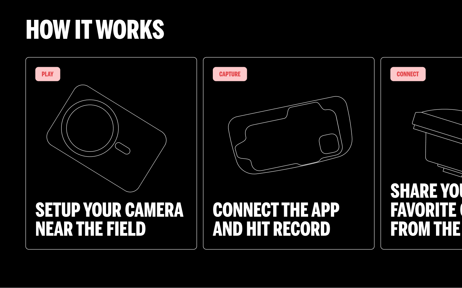
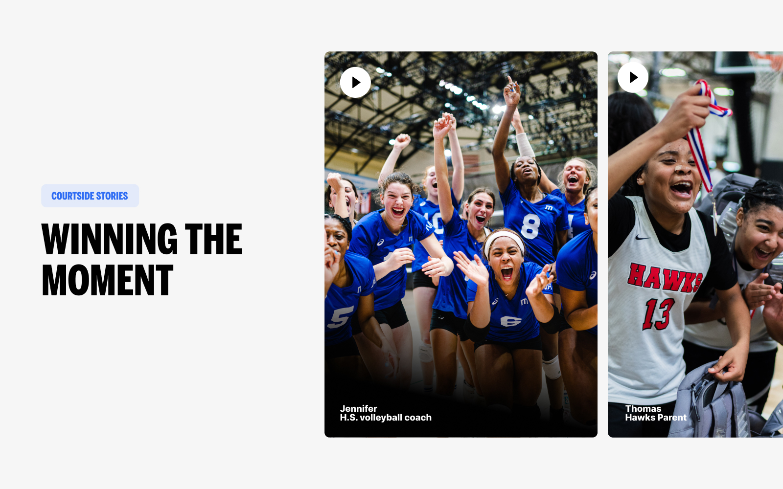
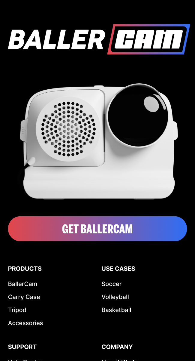
BallerCam turns an iPhone into an AI-powered sports camera that automatically tracks play and generates footage athletes can stream, share, and revisit. The site needed to give the technology a confident, accessible voice across basketball, soccer, volleyball, and football. Athletes including Alex Morgan and Dwyane Wade now serve as ambassadors for the product.
Casa Ayla
Making a shop feel like a place, not a shelf.
Web Design
Made with BRAINS
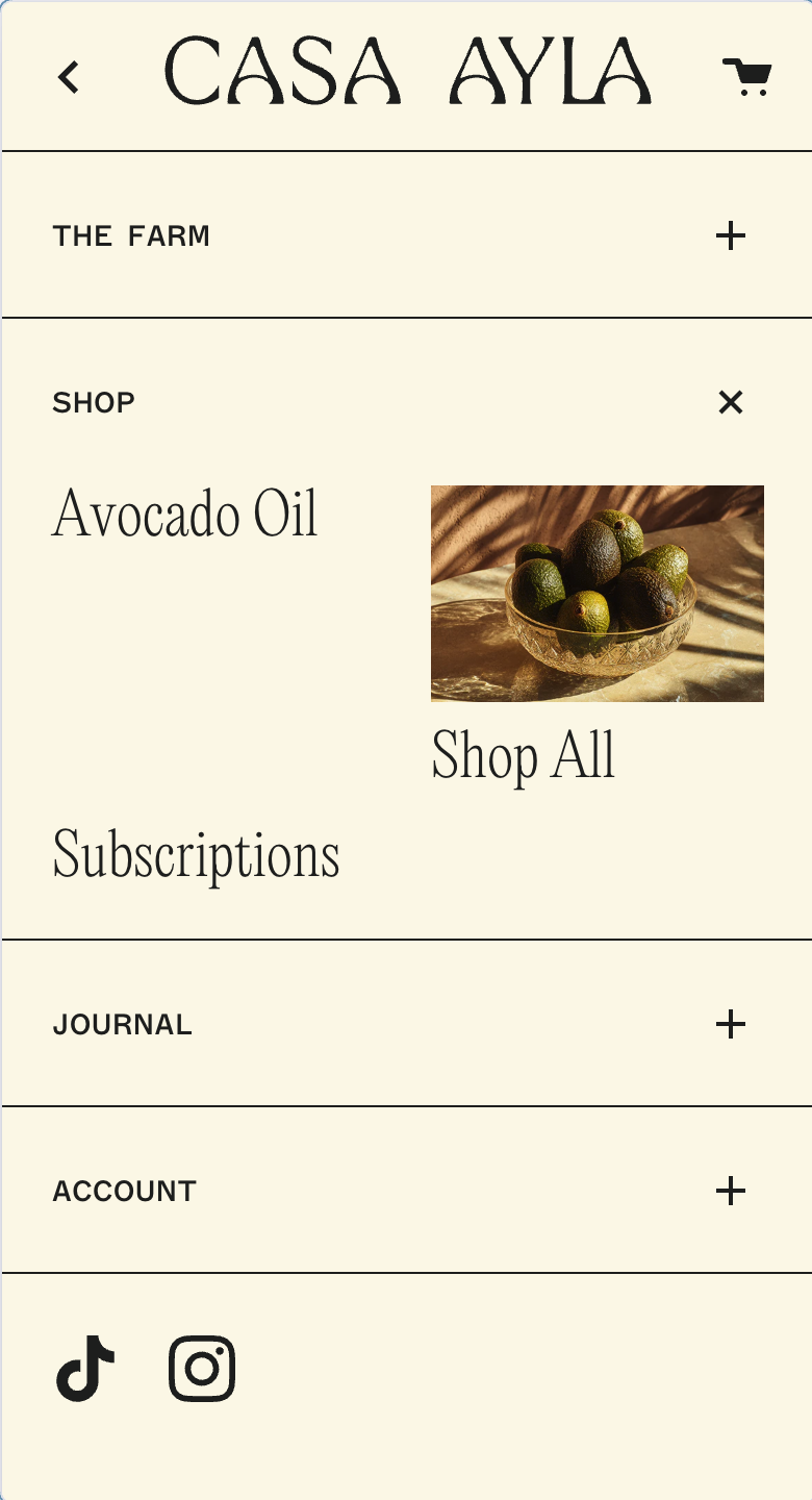
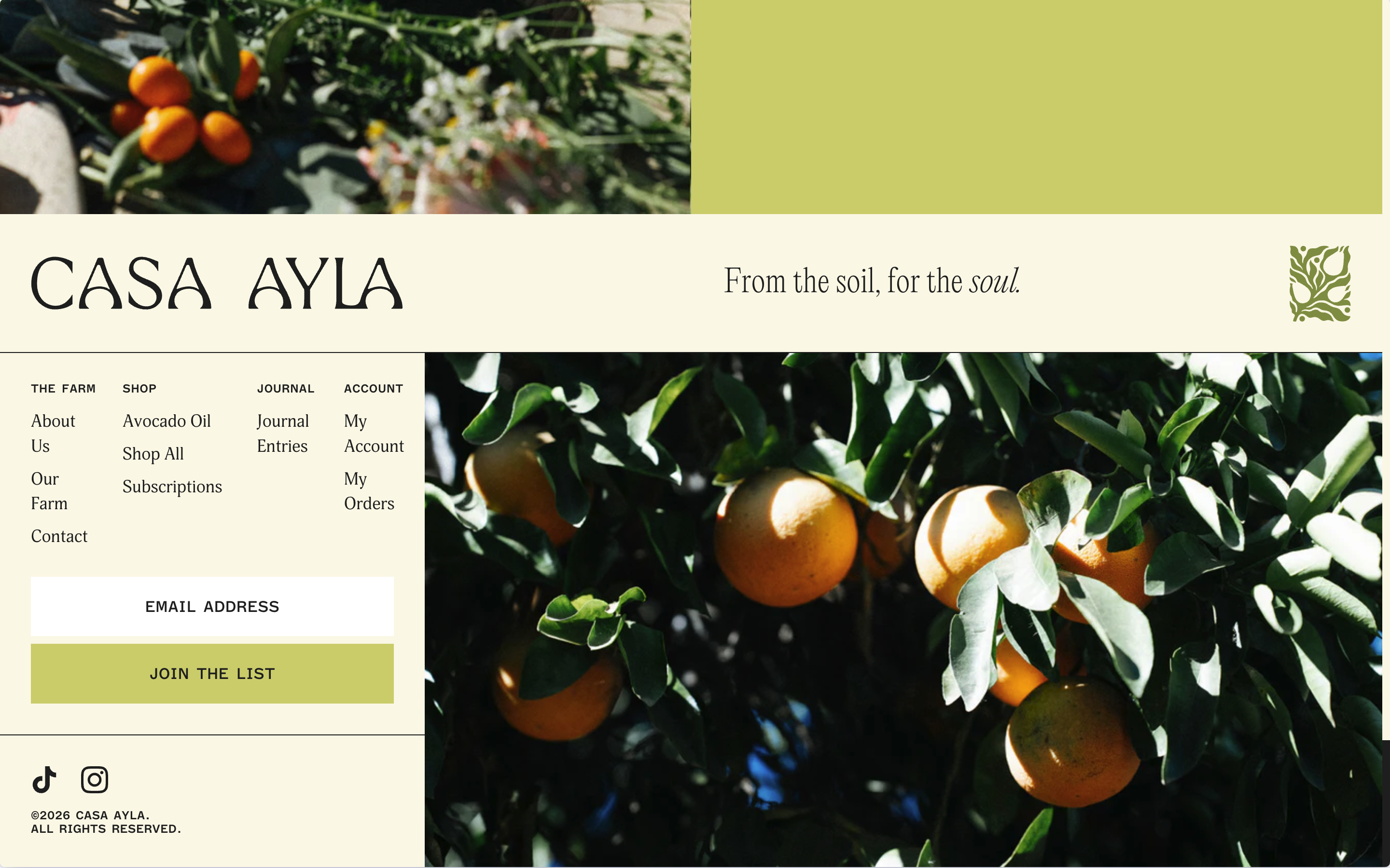
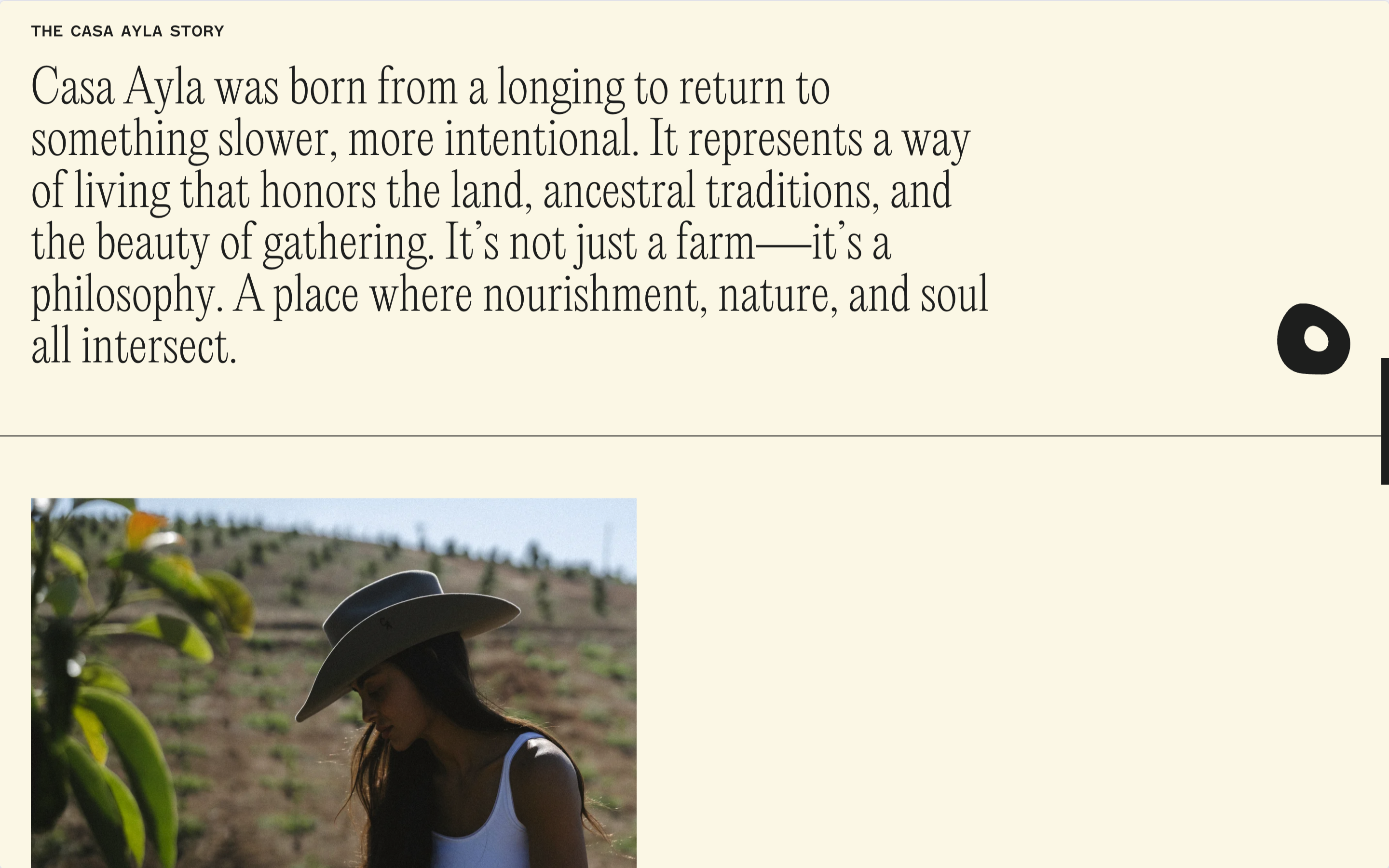
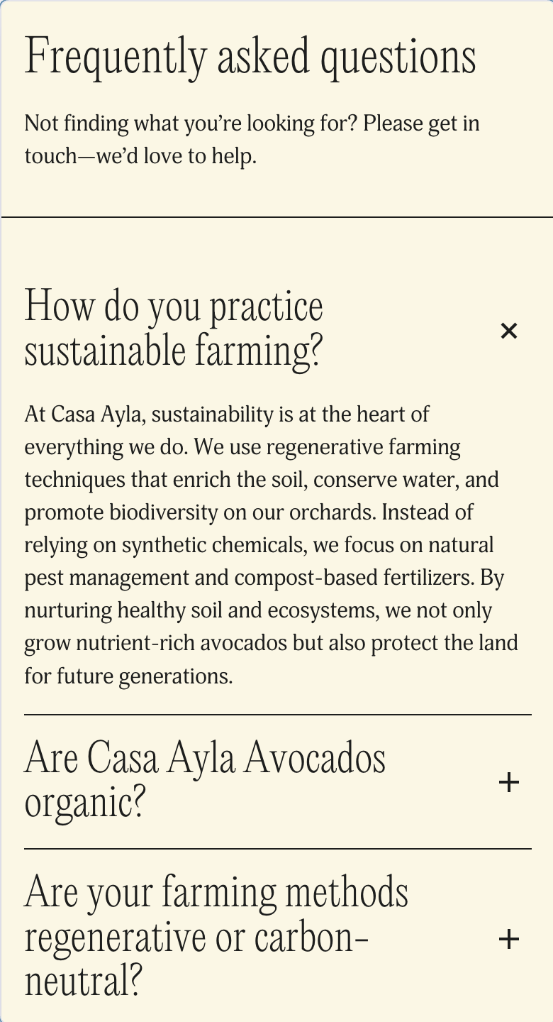
Casa Ayla needed a website to carry the brand’s sensibility beyond individual products. I developed the selected digital direction and design, turning a farm stand into an editorial world across the oils, produce, and recipes. The system keeps the experience considered and the shopping direct.
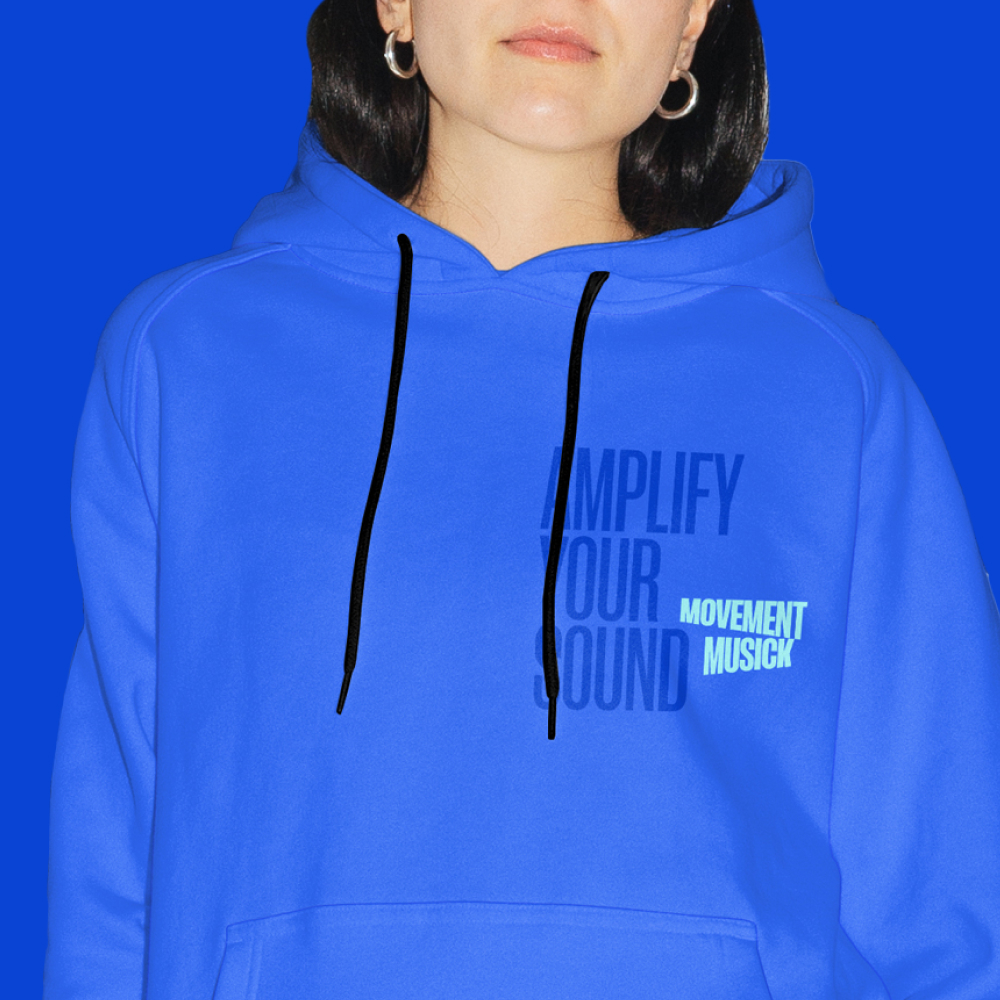
Image Caption
Nex
Letting the experience explain itself.
Web Design
Made with BRAINS
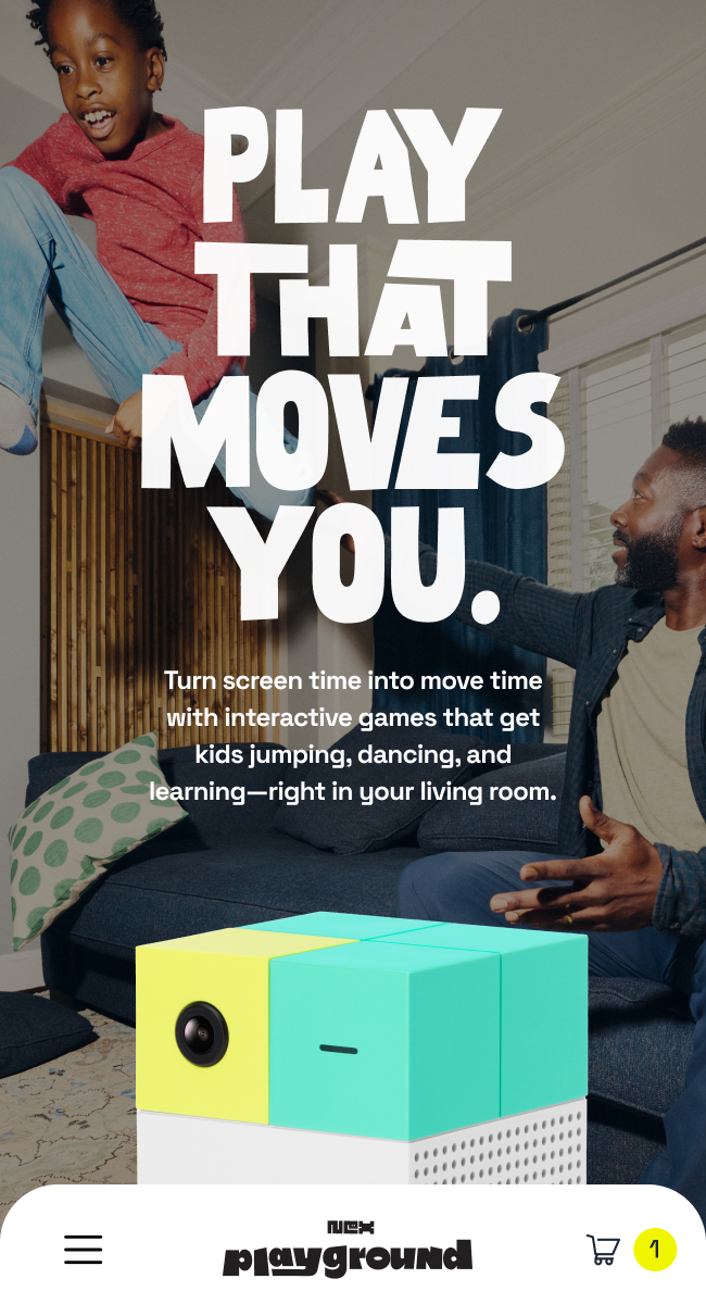
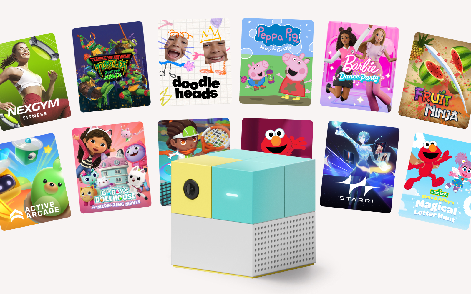
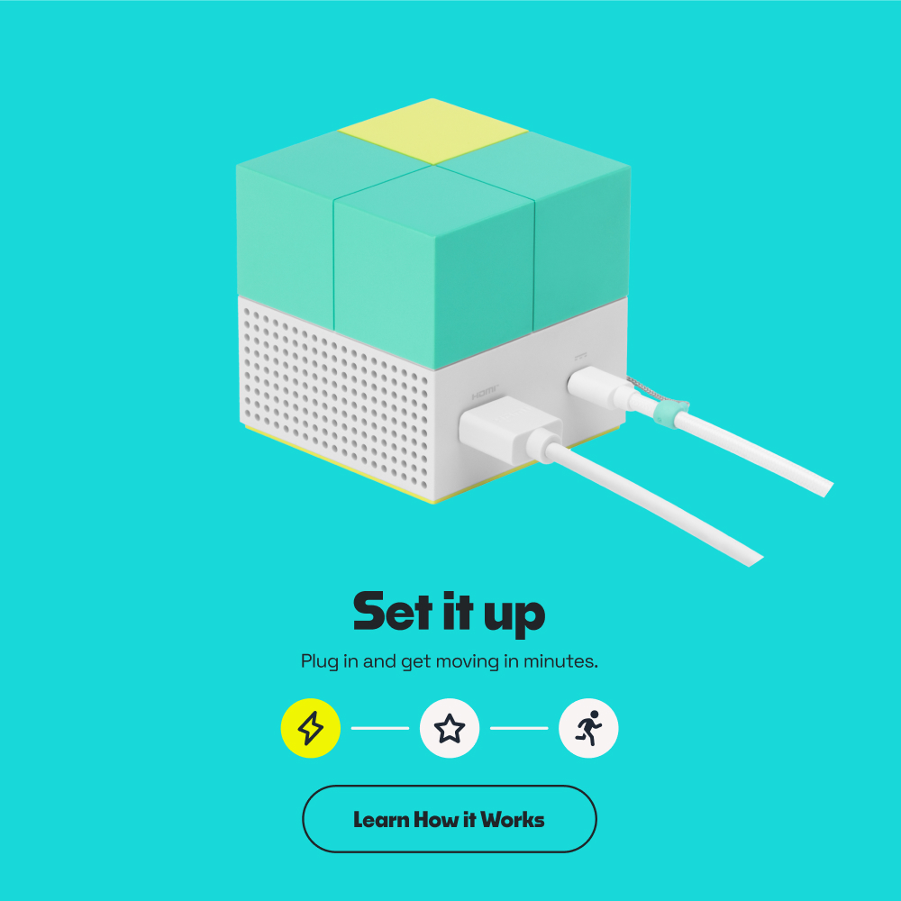
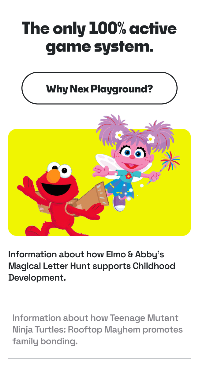
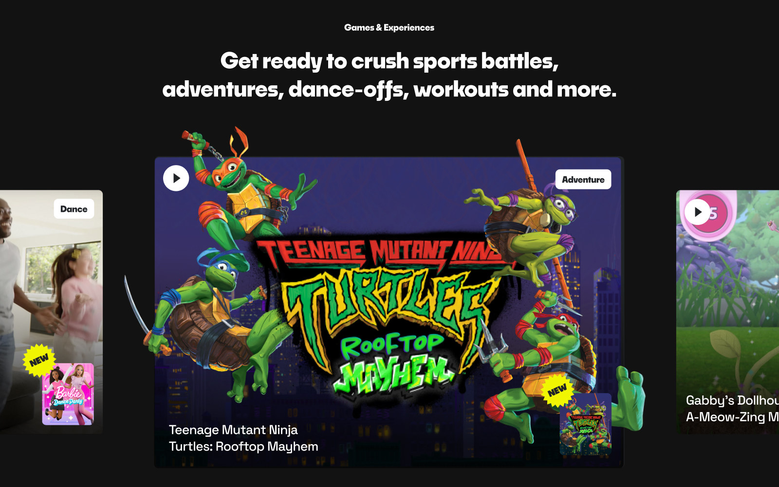
Nex Playground turns any screen into an active-play space, using motion tracking and games to get families moving. The site needed to make the technology feel immediate and playful rather than technical, across product education, a game library, and retail purchase paths. I explored and developed the digital direction—hierarchy, product demonstration, and moments of motion—that let the experience explain itself.
Movement Musick
Giving a music nonprofit an identity built to perform.
Brand Direction
Made with BRAINS
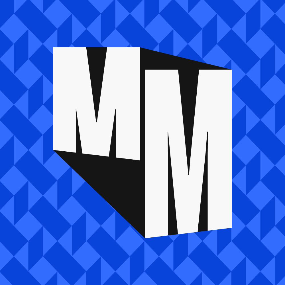
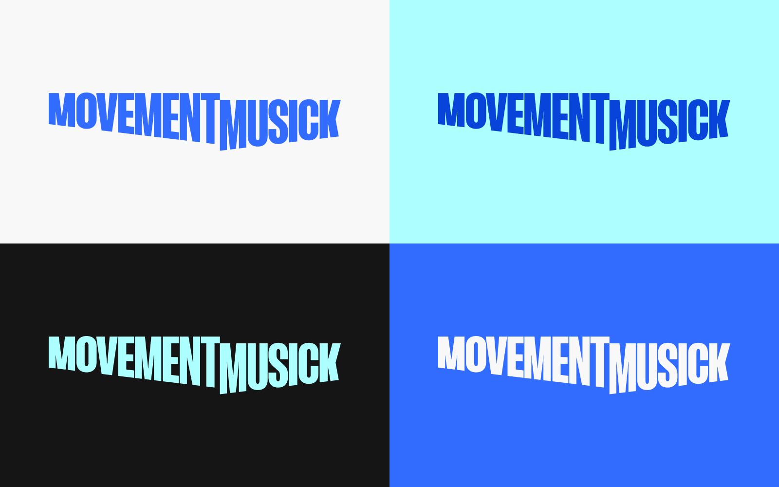
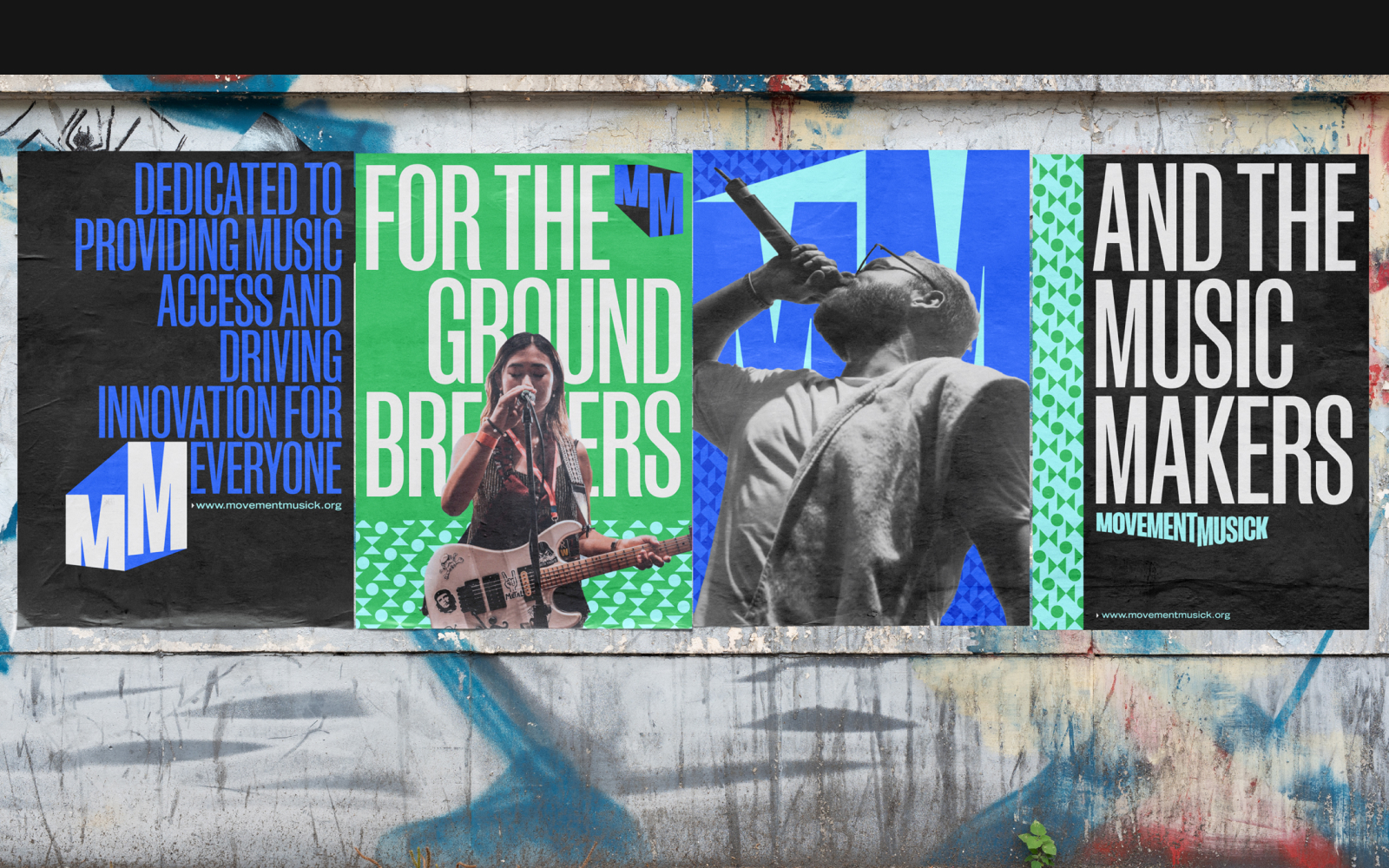
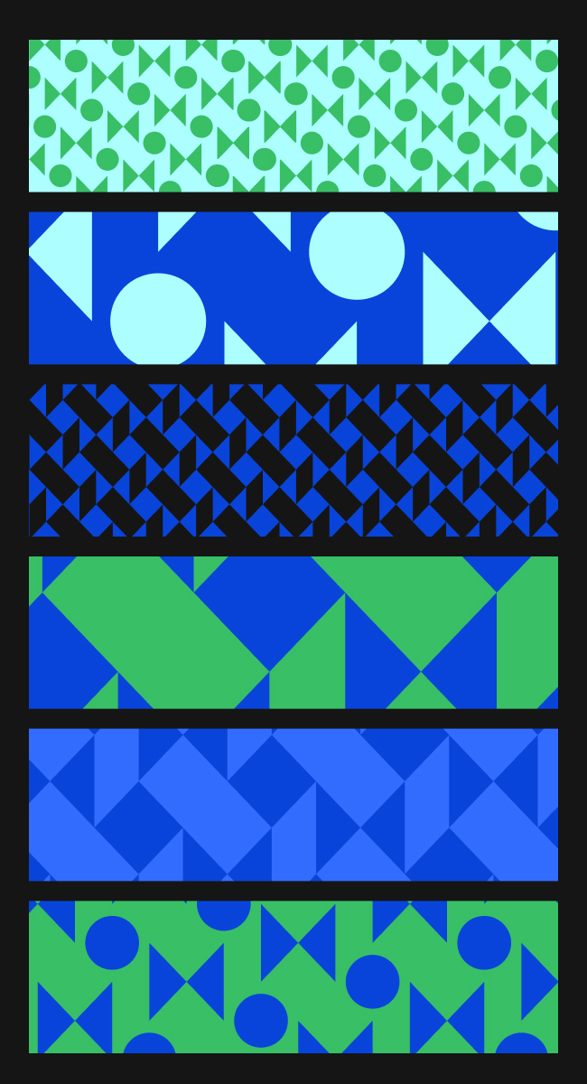
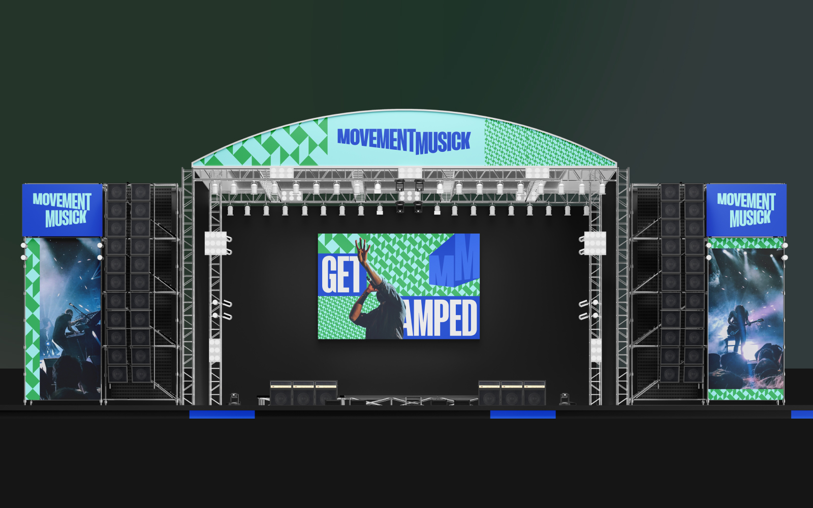
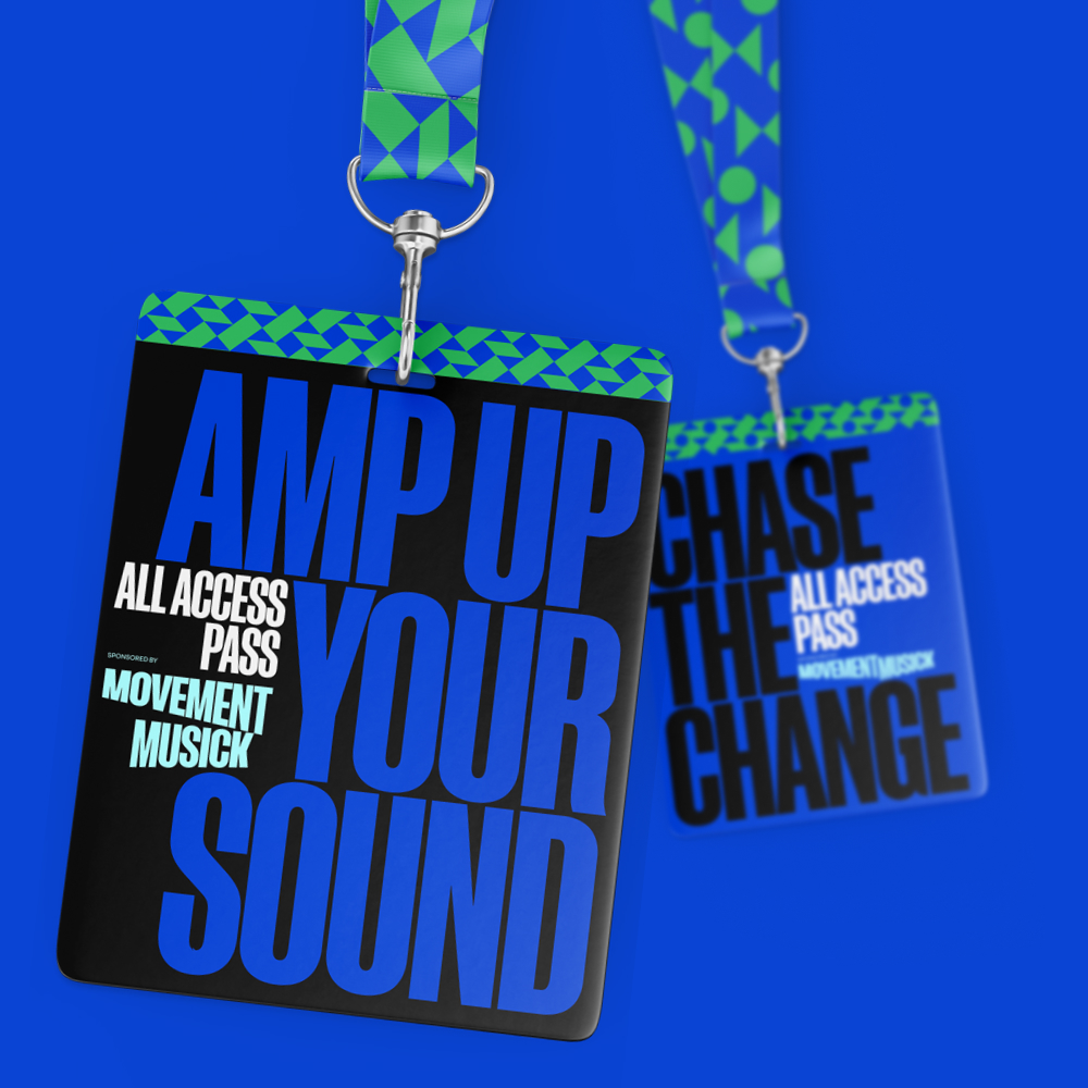
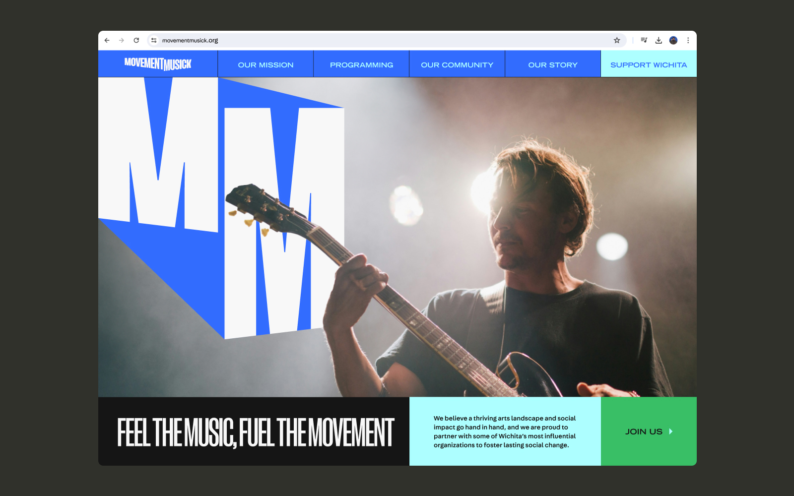
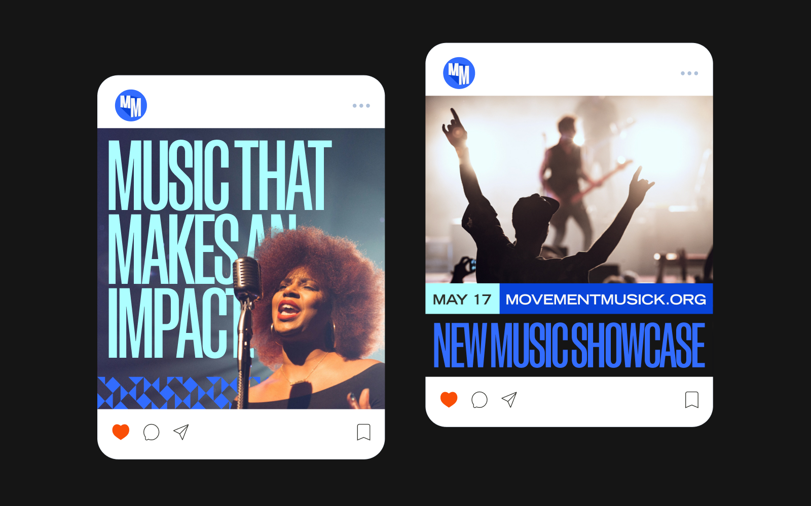
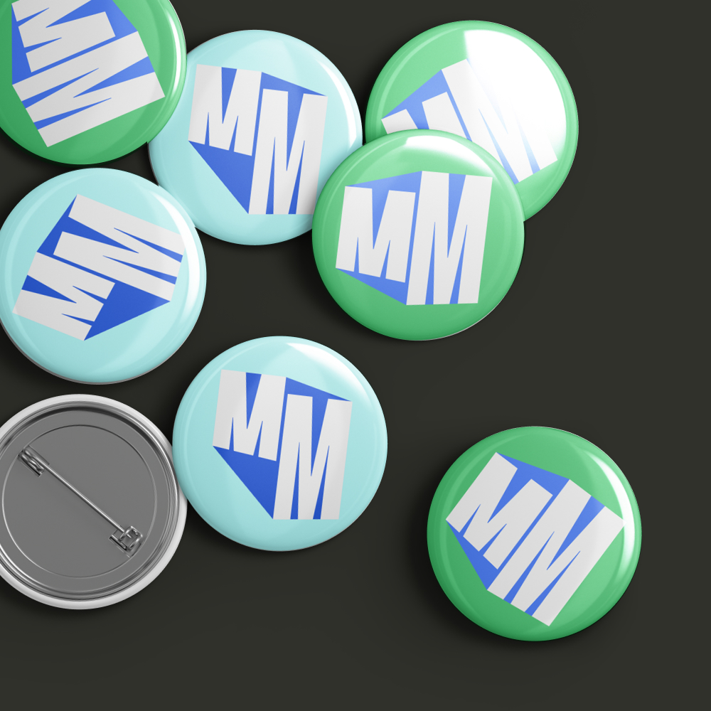
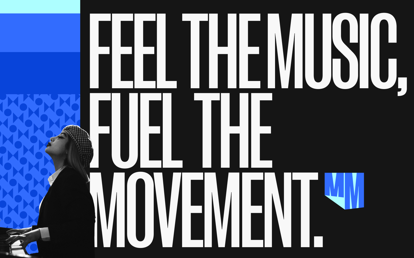
MovementMusick is a Wichita-based nonprofit that expands access to music and supports emerging talent. For this pitch, I developed a flexible typographic identity built around dynamic letterforms, paired with high-contrast concert photography to carry a crowd's energy, made to hold up on a festival stage as easily as on a lanyard. It extended across posters, merch, social, stage, and web design.
BETR Remedies
Extending a brand into the physical world.
Packaging, Out-of-Home Campaign
Made with BRAINS
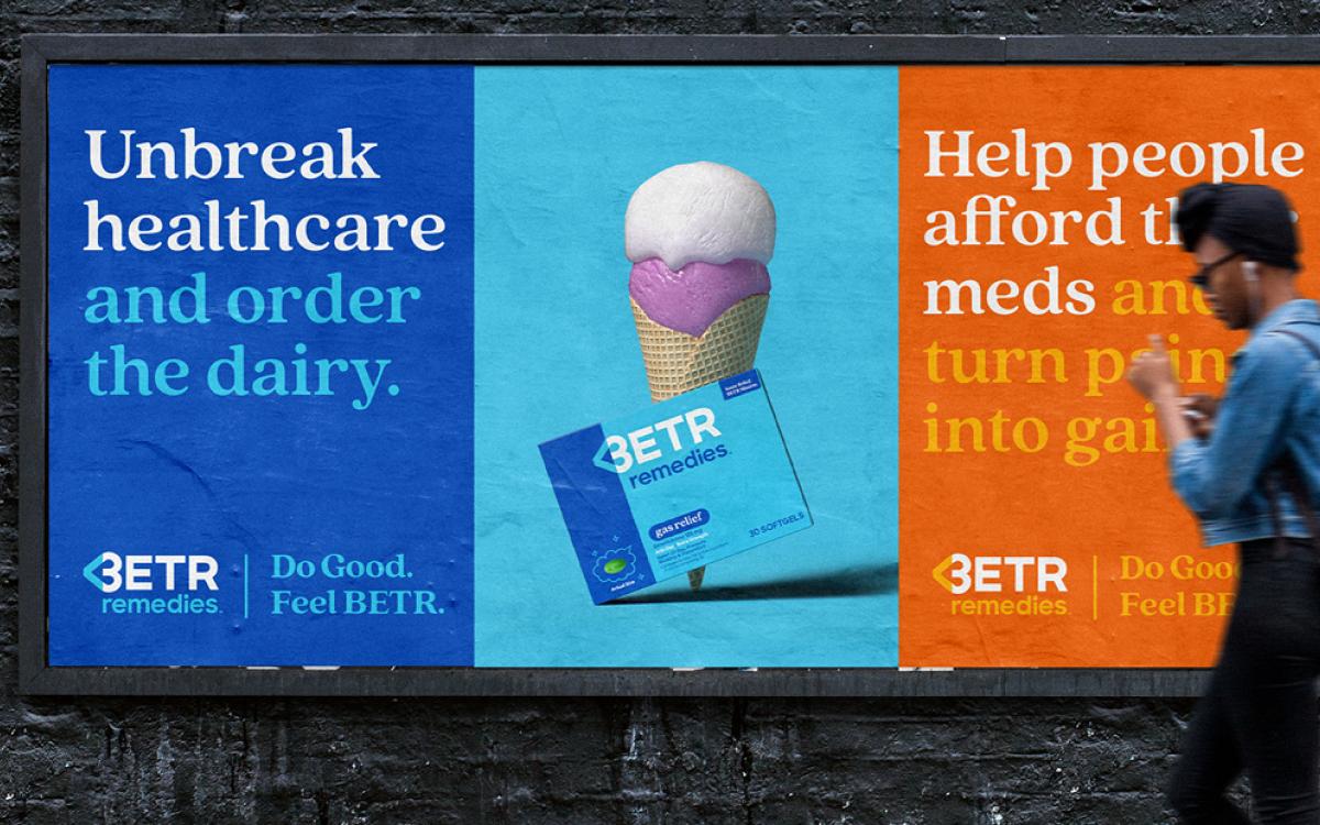
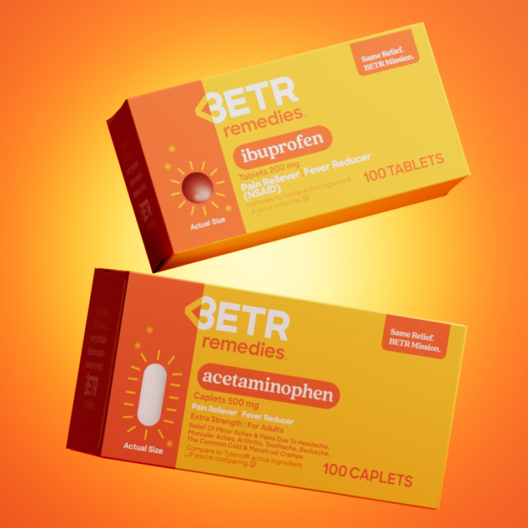
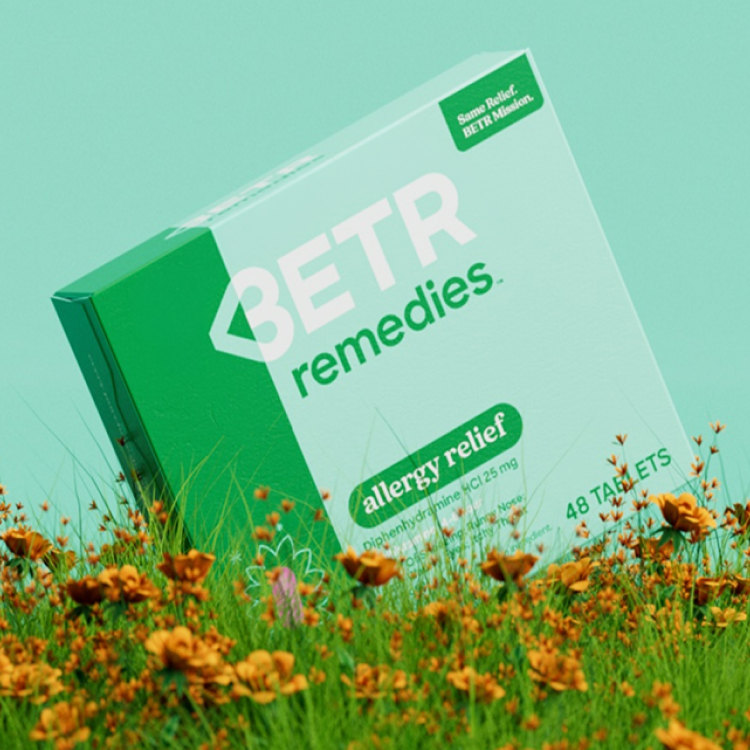
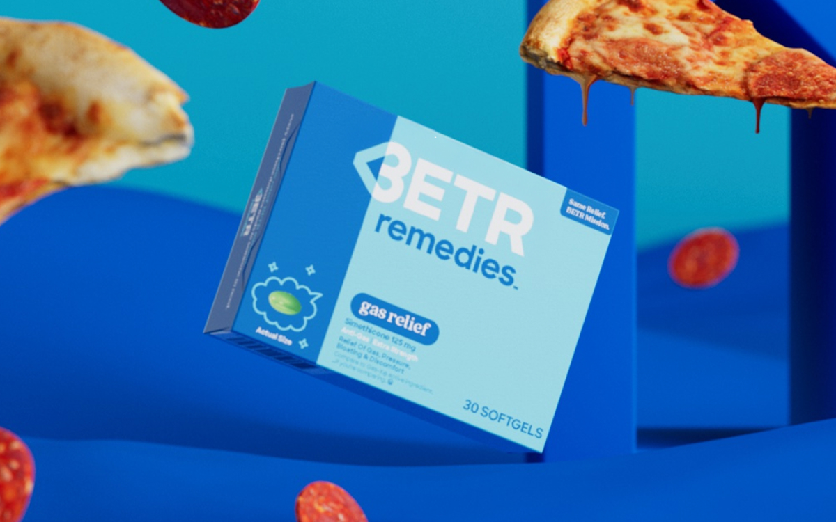
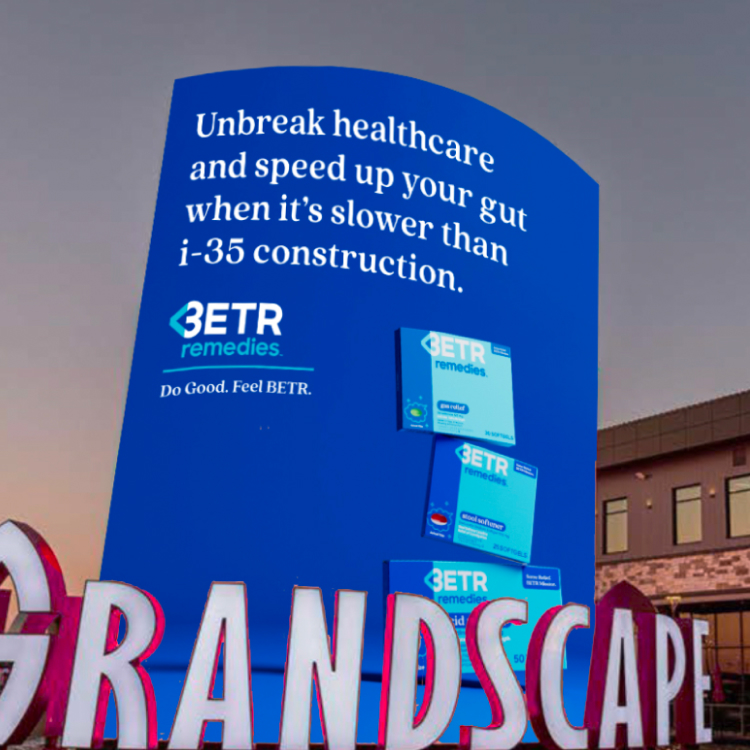
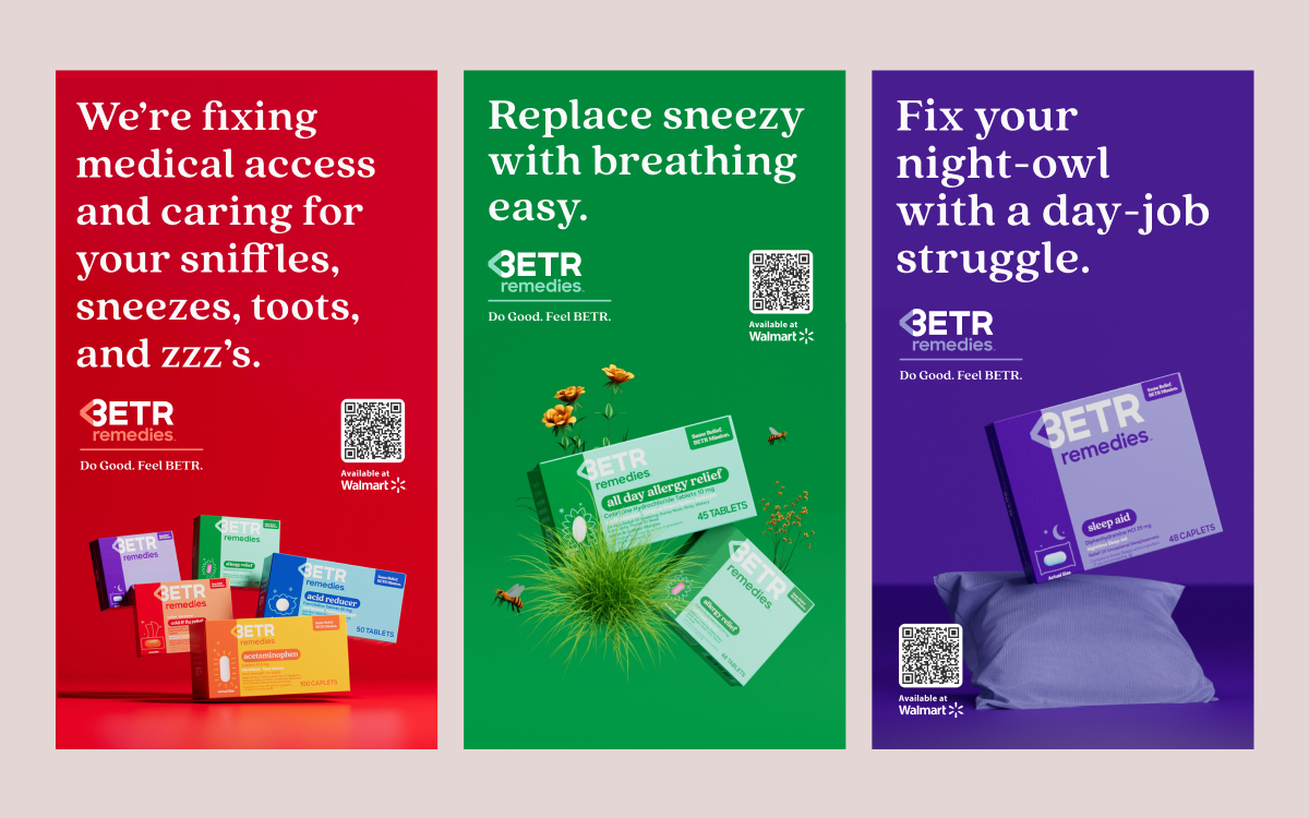
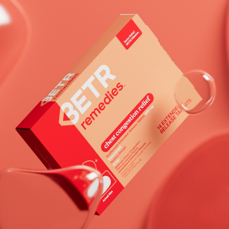
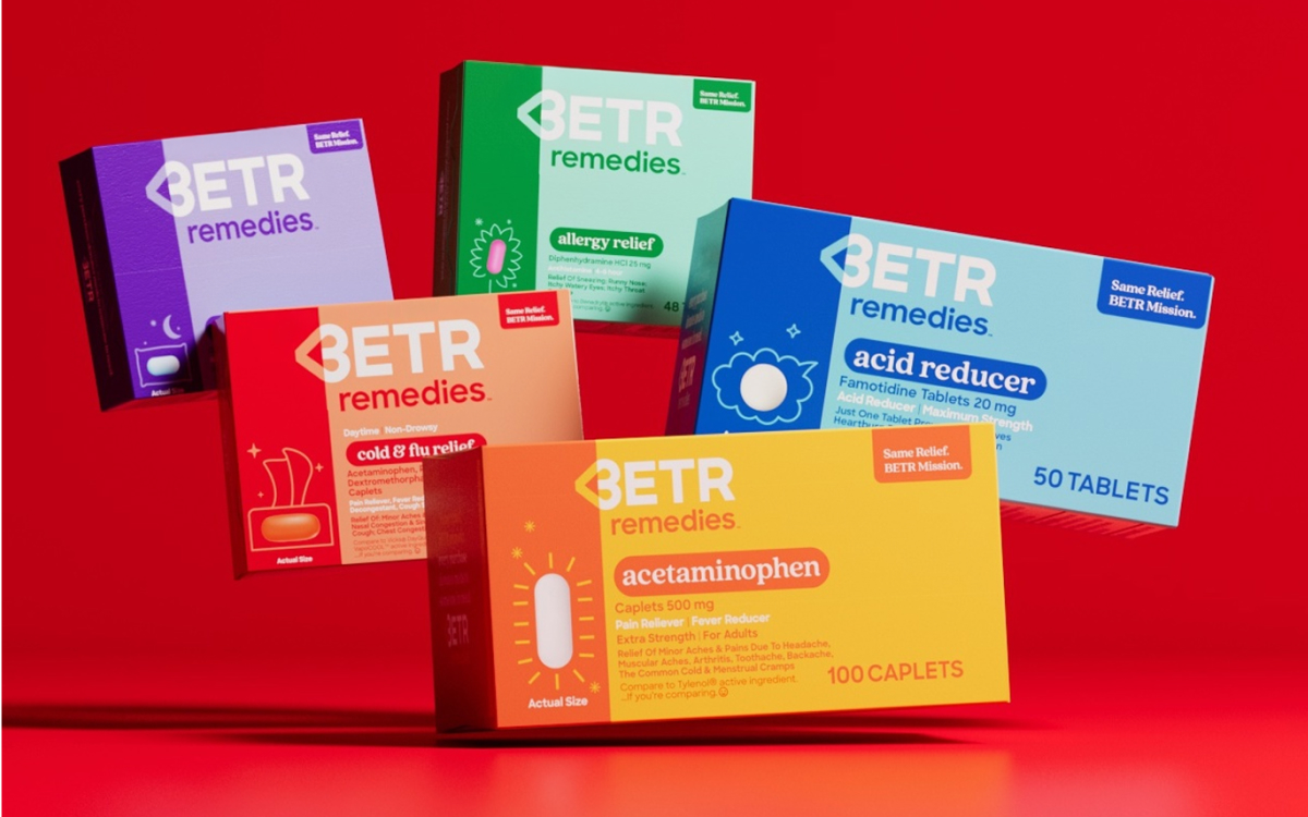
Built around a mission to make healthcare more affordable, I worked to extend BETR’s system into new packaging, then into campaign and out-of-home applications. Packaging carried the identity into a new category, and the environmental work pushed it toward maximum scale and speed.
MTRL Goods
Making utility feel unmistakable.
Brand Direction
Made with BRAINS
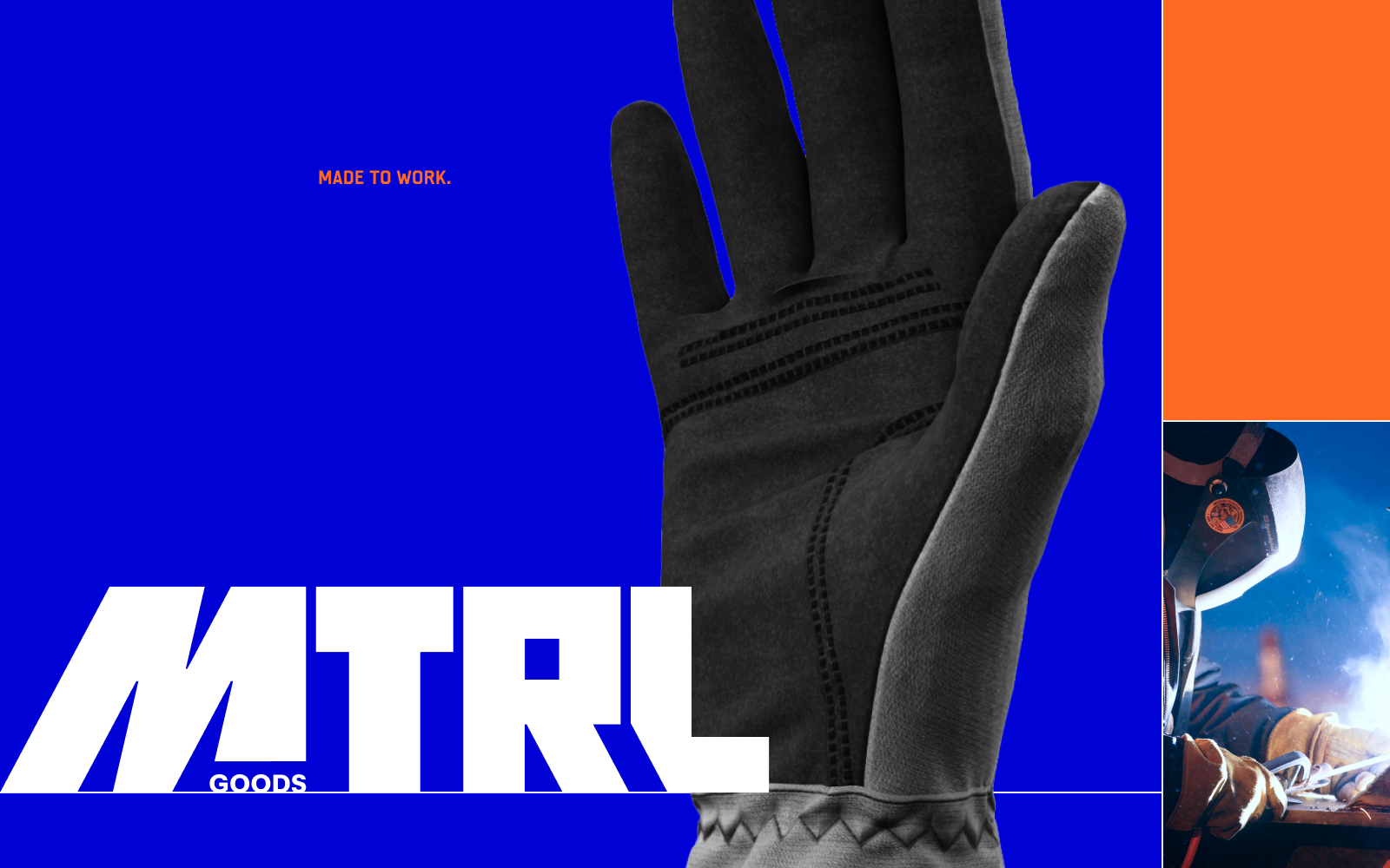
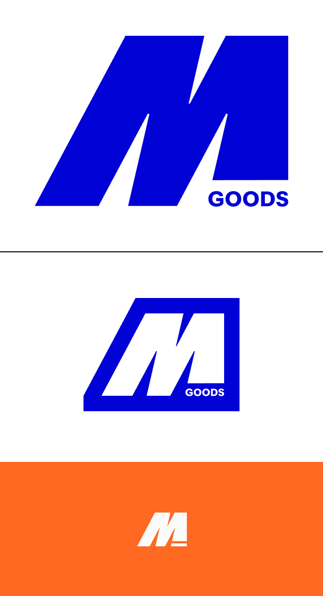
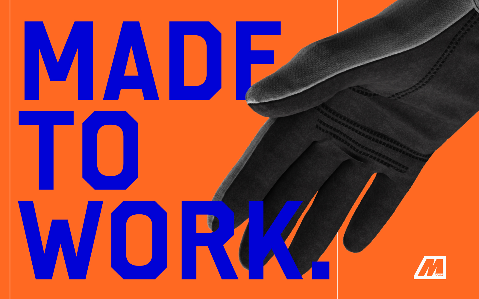
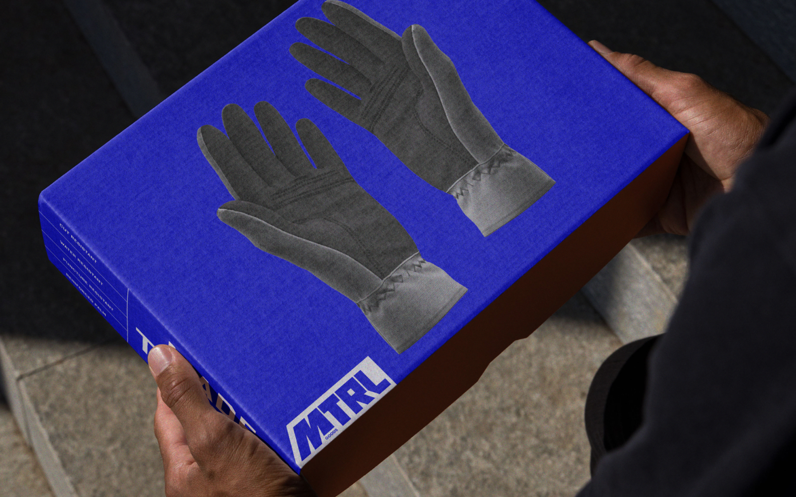
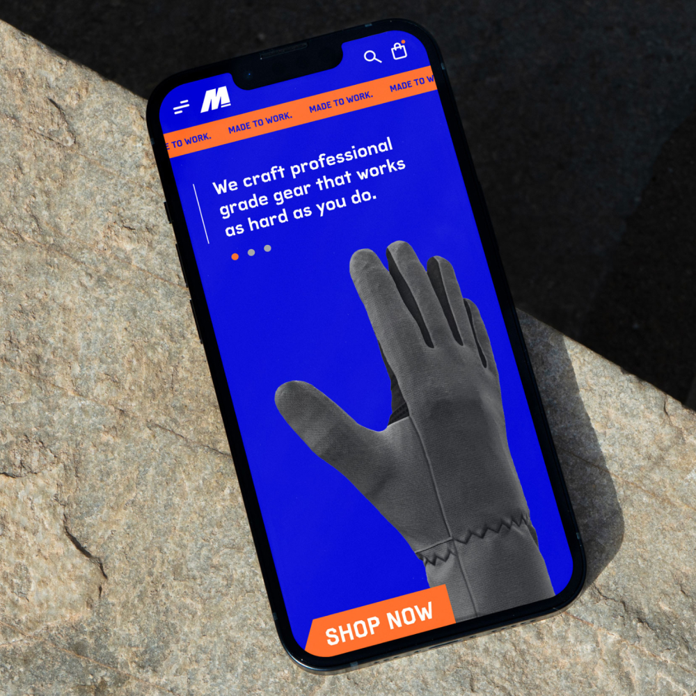
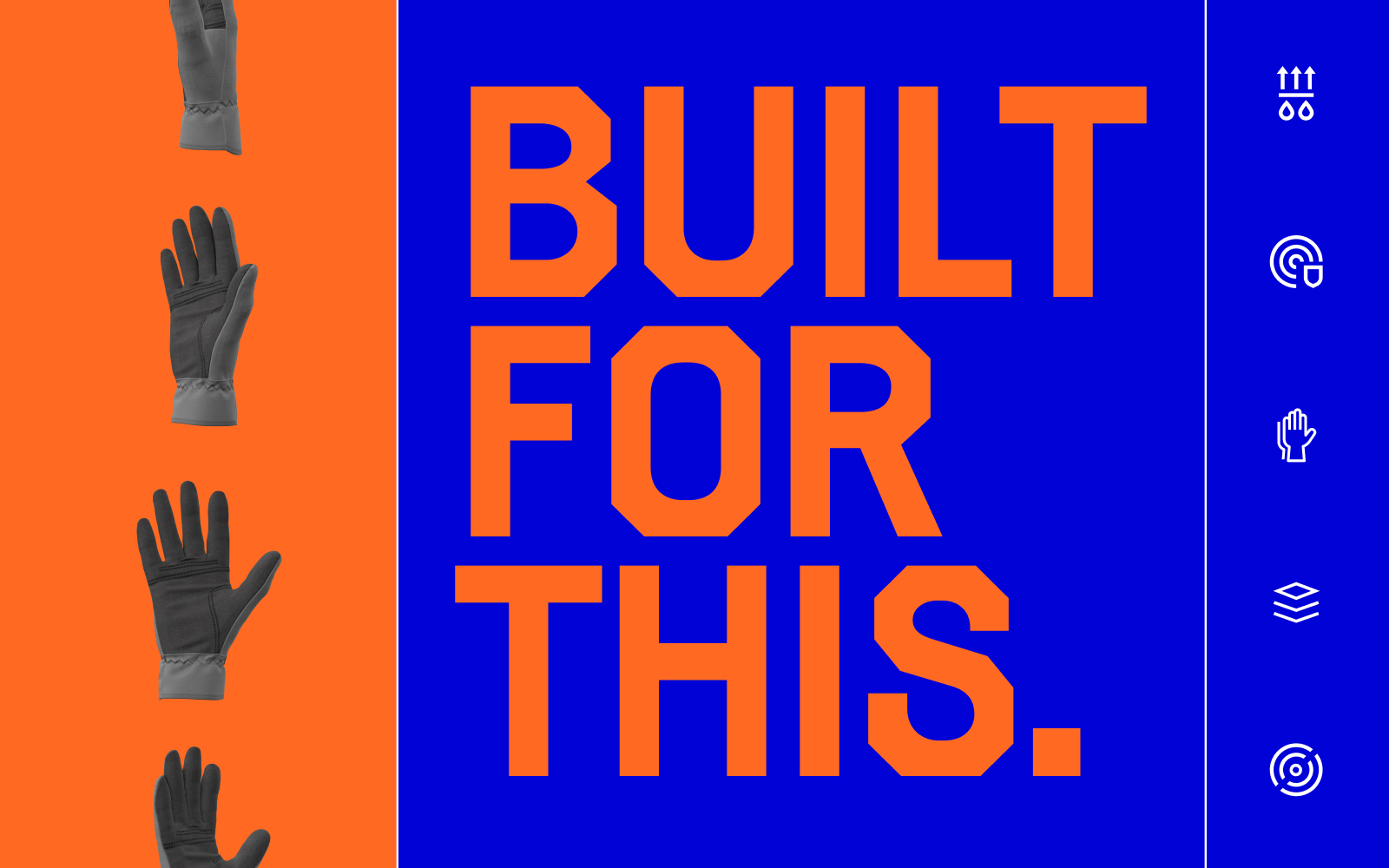
MTRL Goods entered a crowded work-glove category. I designed the visual system to give practical gear a reason to stand out, without losing the directness the category expects—a diagonal-cut M mark, a bold utility typeface paired with a sturdier serif, and a high-contrast blue-and-orange palette carried from the glove itself onto packaging, product photography, and campaign applications.
United Housing Connections
Designing for people starting over.
Brand Direction
Made with BRAINS
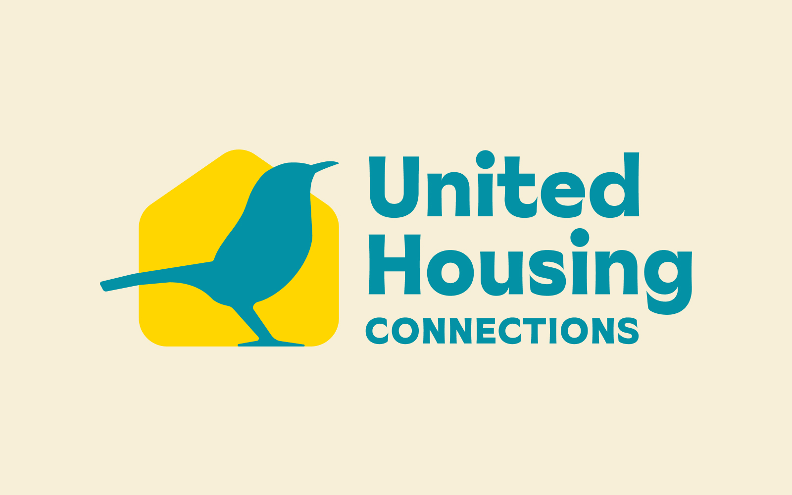
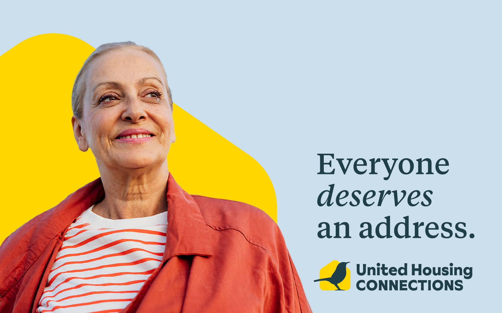
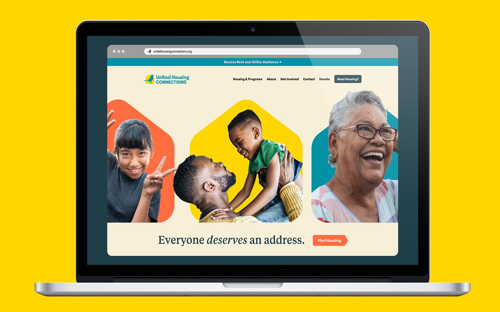
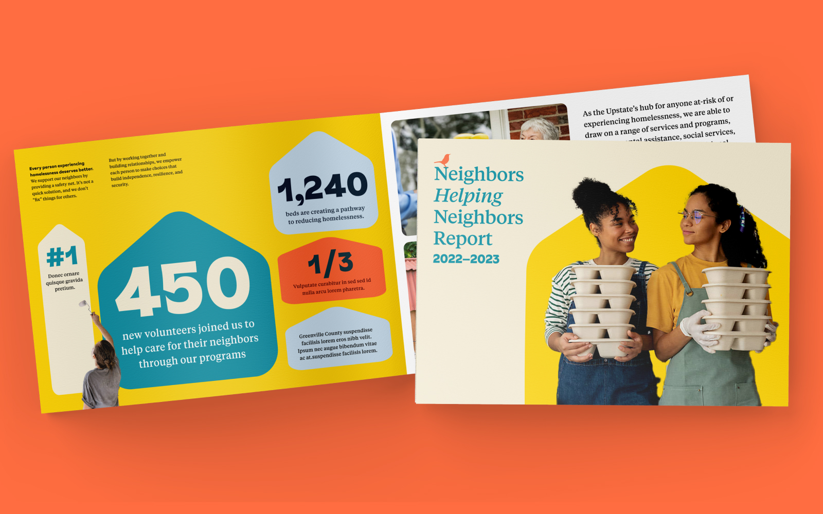
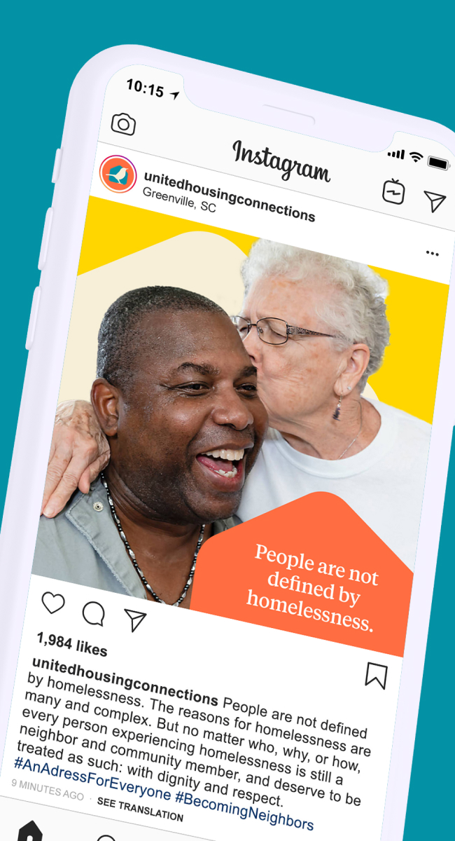
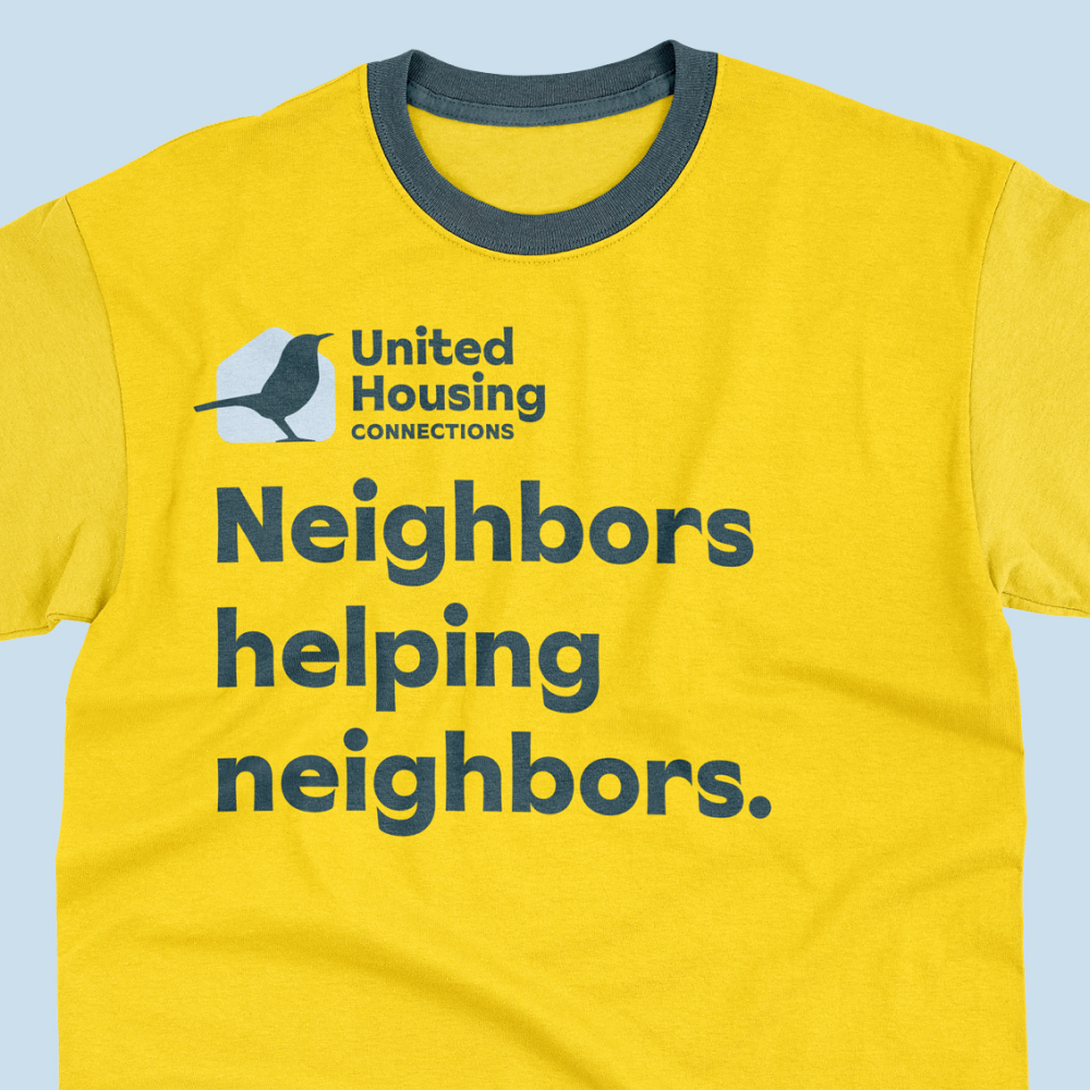
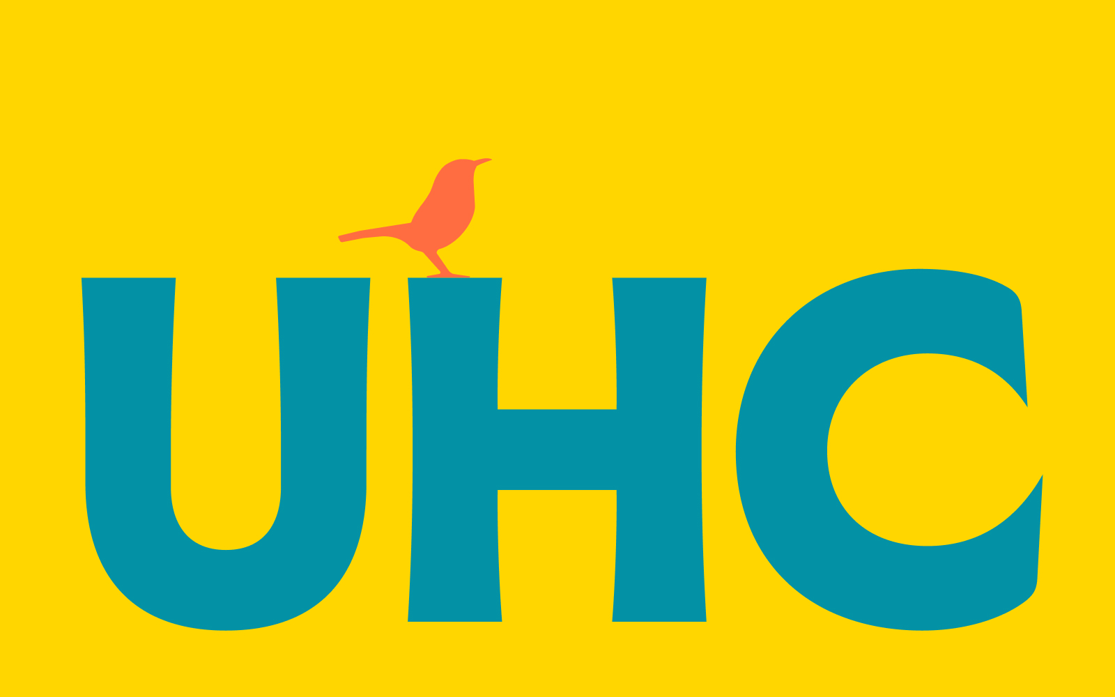
United Housing Connections works to make homelessness as short-term as possible for the people it serves. I designed a new visual identity centered on the Carolina Wren, a bird known for rebuilding its own nest—a fitting symbol for the courage it takes to rebuild a life with dignity. Paired with a confident display type and a literary serif for warmth, the system extended across web, social, signage, print, and apparel.
CASE Floors
Elevating a family business without erasing it.
Web Design
Made with BRAINS
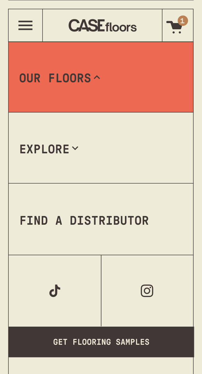
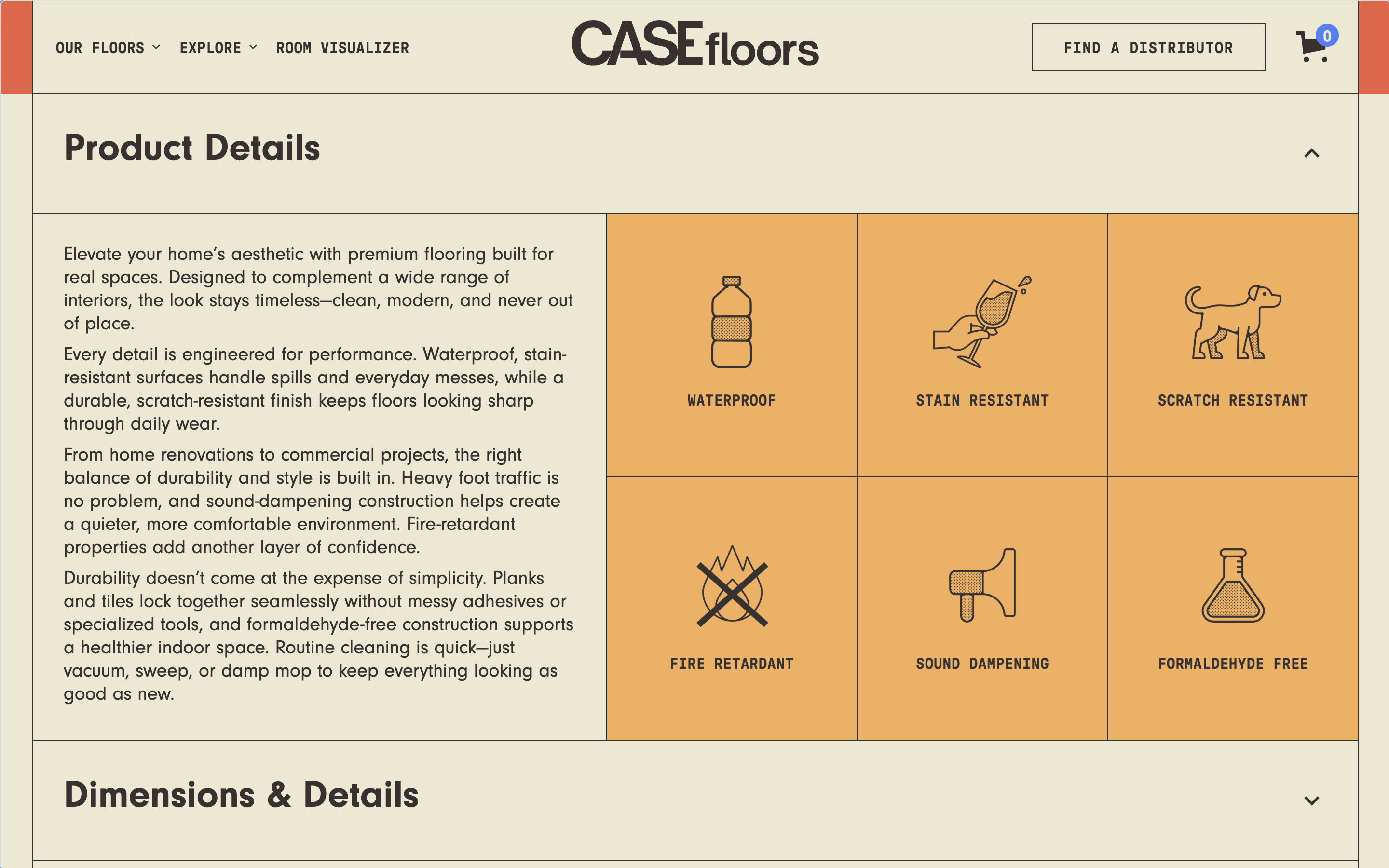
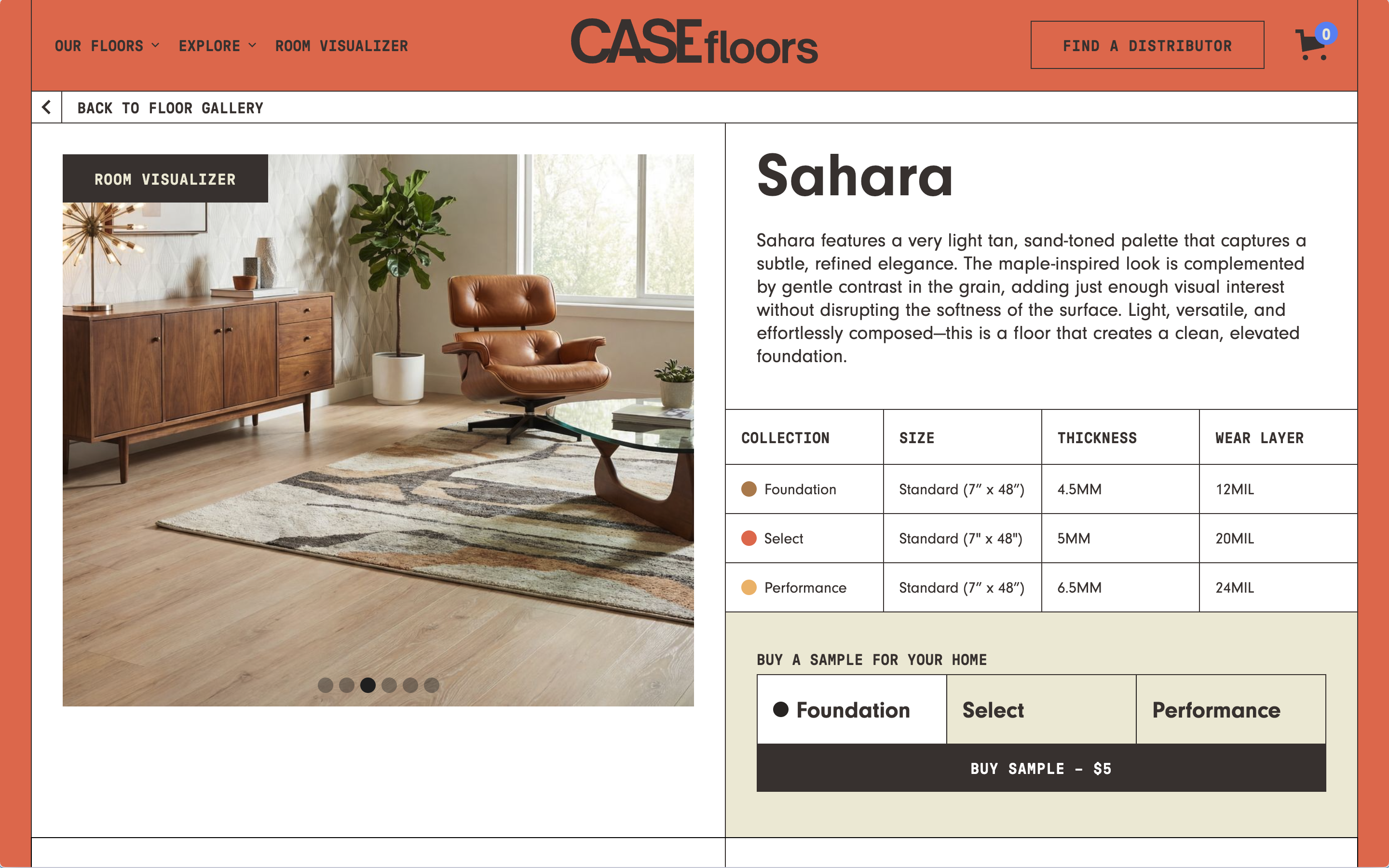
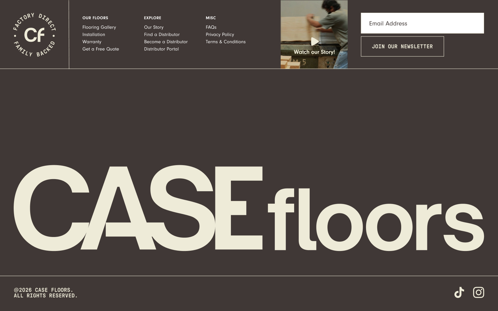
Elevating a brand to reflect a product's quality can strengthen, rather than erase, the authenticity of a family-owned business. CASE Floors sells premium flooring factory-direct through a network of local distributors, a structure built to help small business owners grow. The page is structured around how the product works—with sections clicking into place while color, illustration, and photography balance precision with warmth.
Image Caption
MAGNA-TILES
Making the real thing impossible to miss.
Web Design
Made with BRAINS
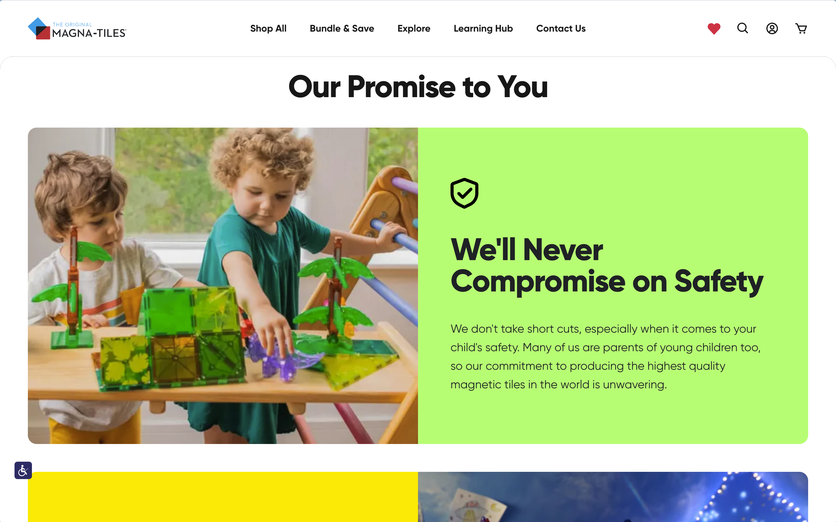
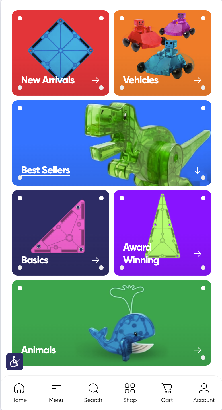
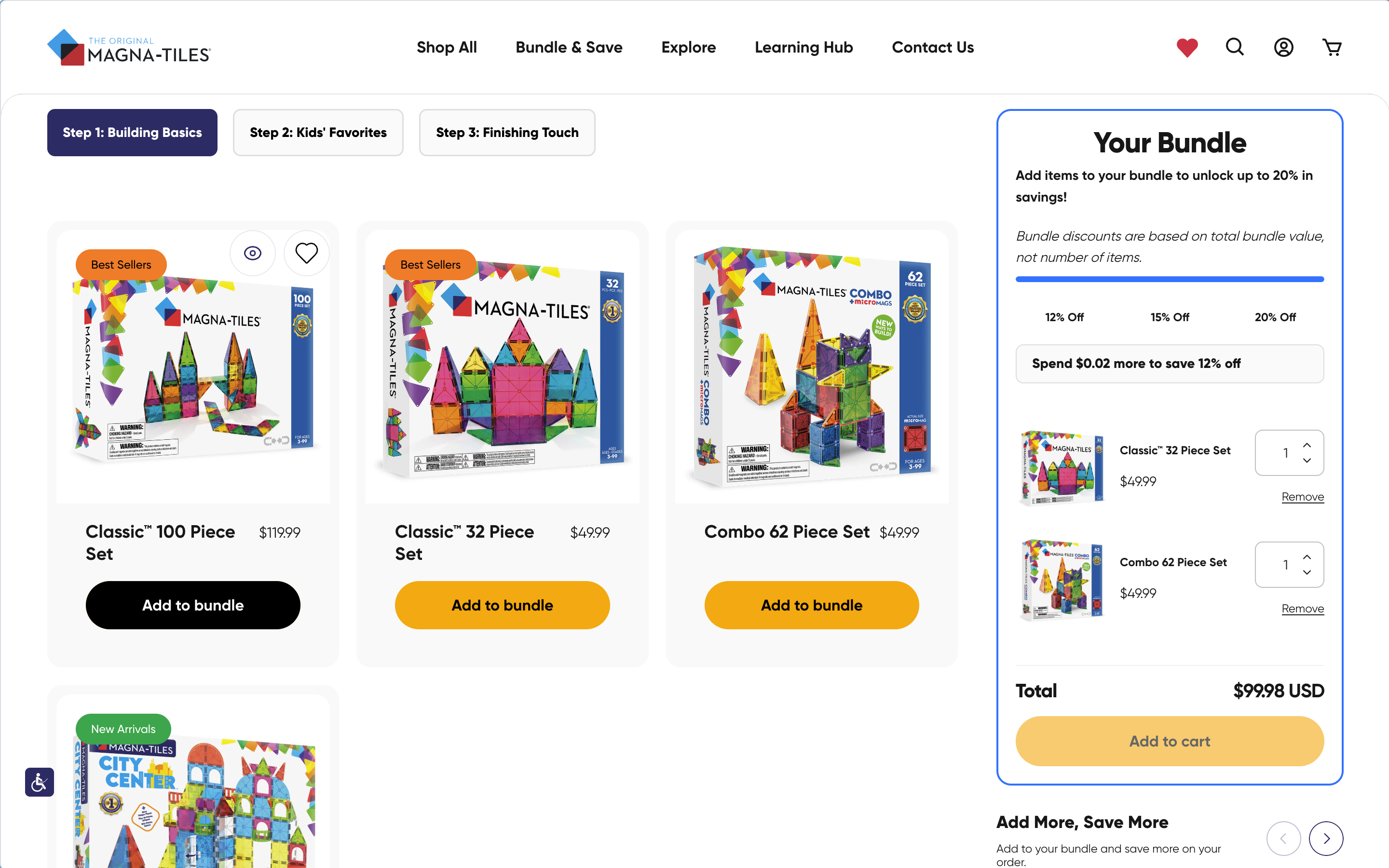
MAGNA-TILES already had an instantly recognizable product—colorful magnetic shapes built for open-ended play. The site needed to translate that energy into a digital system to give the toy a digital presence as premium as the product itself, carrying that confidence through education, inspiration, and commerce. The client reported a 50% year-over-year increase in sales following launch.
This is some text inside of a div block.